Description
Our team was tasked with redesigning Hollister Staffing's website, and creating a companion site for another section of the business, The Hollister Institute. Their existing site struggled with information hierarchy and user flow, and did little to reflect the personality of the company.
We worked with their teams to learn about their internal processes, how they work with clients, and find out what was unique about the company. Through this research we were able to improve usability for both employees and users, and translate the culture of the company into a much more inviting website.
Project Duration
Initial redesign over the course of eight months + ongoing updates
Results
20% increase in conversions + rise in candidates, job applications and returning visitors
Project Role
Design Research
Concept
Content Strategy
Information Architecture
User Experience
Wireframing
Prototyping
Visual Design
Photoshoot Art Direction
Custom Illustrations
Asset Production
Specifications & Pattern Guide
Content Population
QA Testing
Project Management
Information Architecture
Challenge: Determine primary goal of users that identify in multiple ways

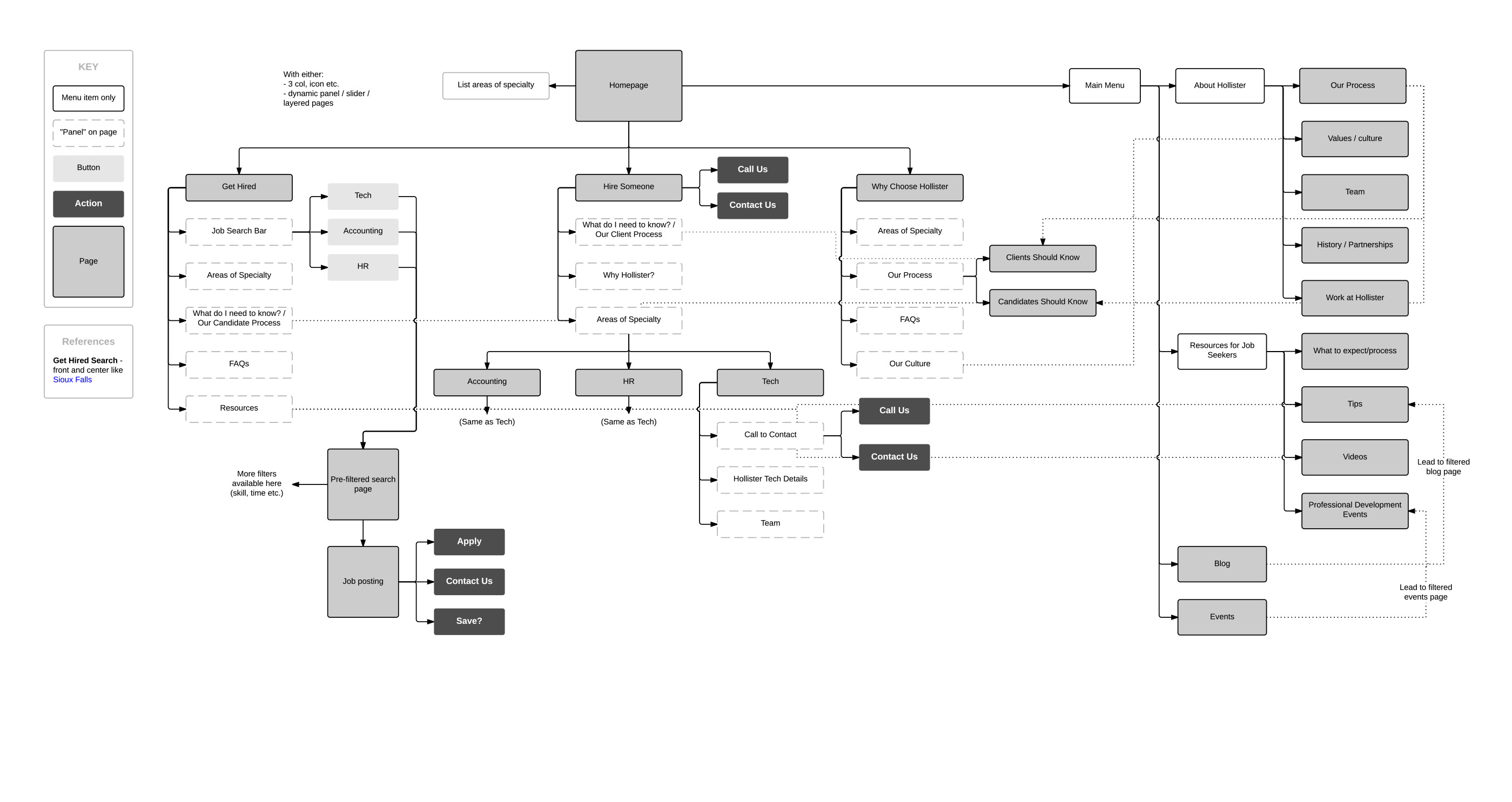
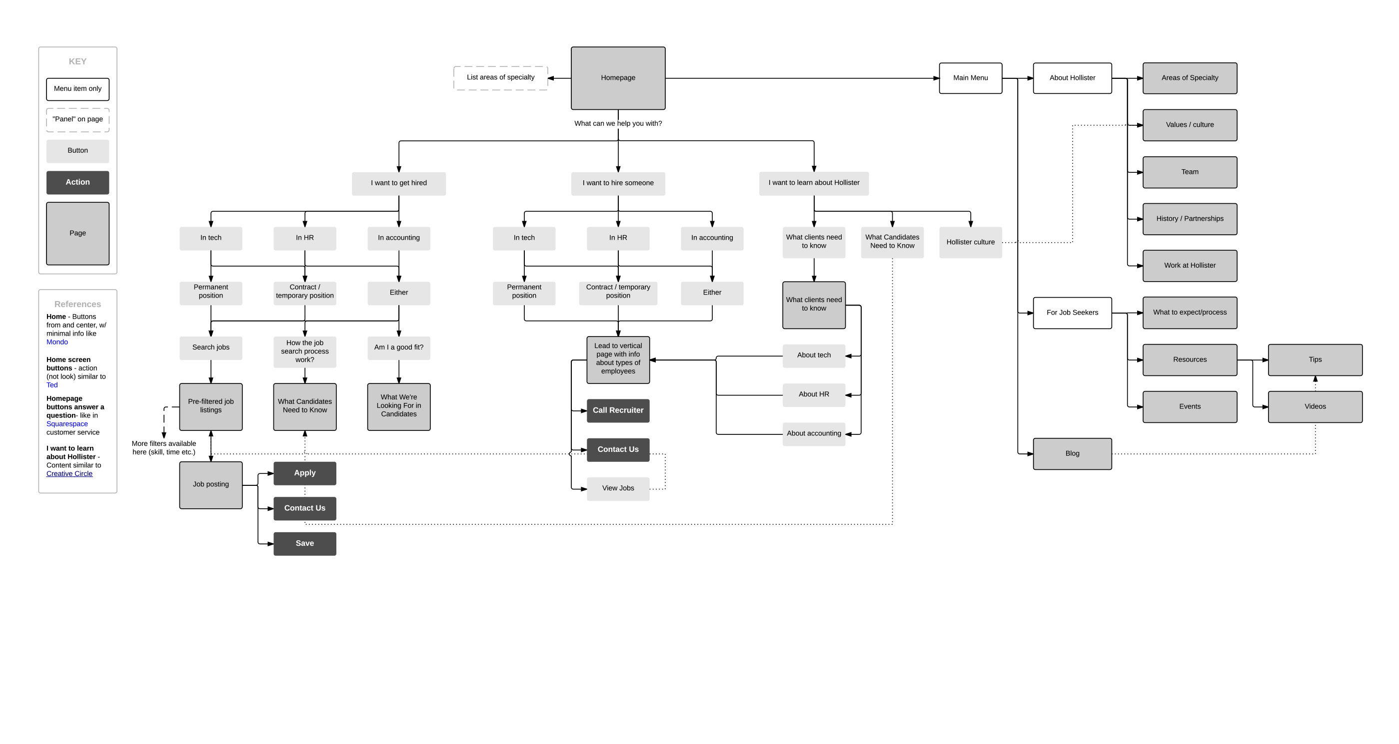
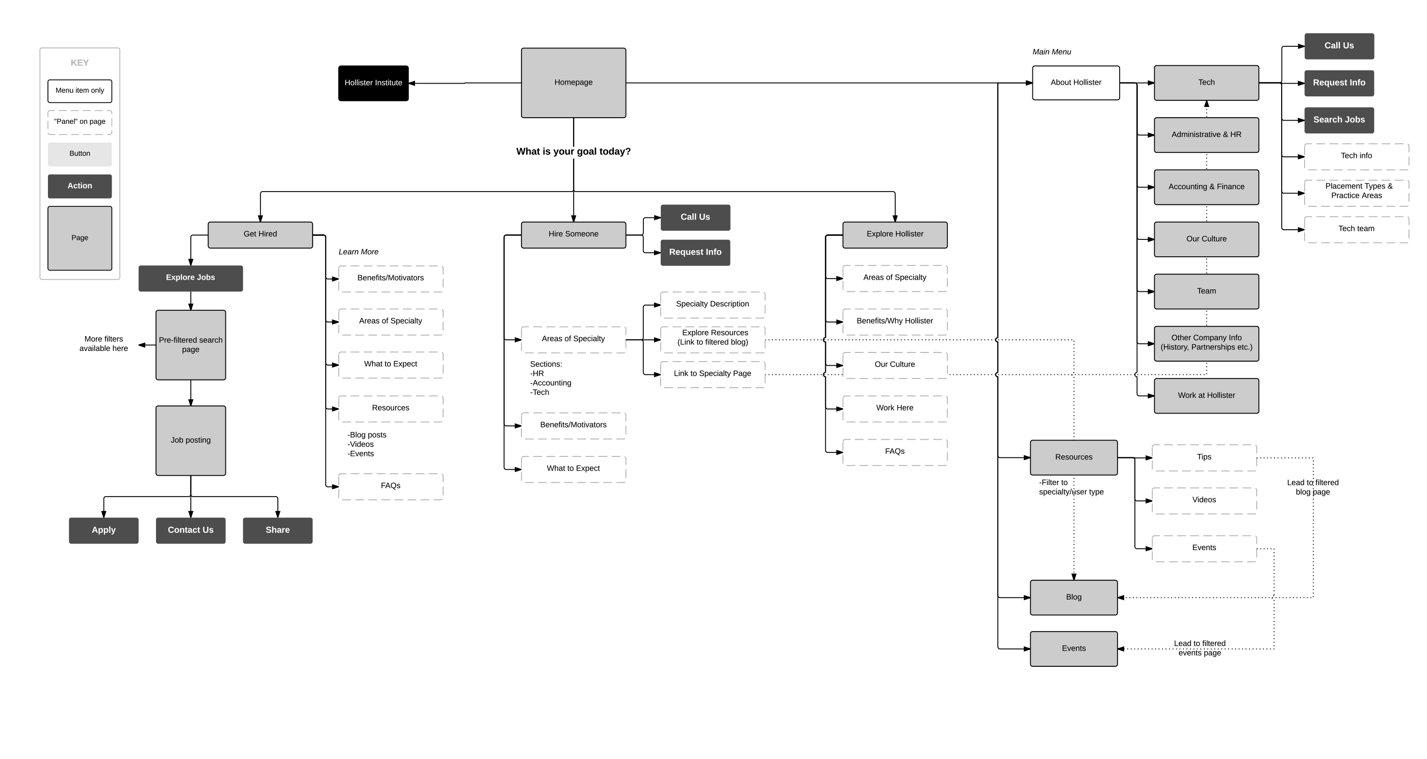
Accommodating overlapping user types
It became clear through discussions with the various teams within Hollister that the user types were not clear cut—each user could be identified in more than one way. Through site mapping and prototyping the various paths, we were able to explore which flows allowed users to reach their primary goal most directly. After some analysis, we separated users into three groups based on their goals, and built flows for each.
Primary User Goals:
Get Hired
Candidates
Hire Someone
Clients
Explore Hollister
New visitors

This laid the groundwork for improving information hierarchy throughout the site. Having organized the content into more discrete pages, we were able to reduce information overlap and include new content in a logical location and order.
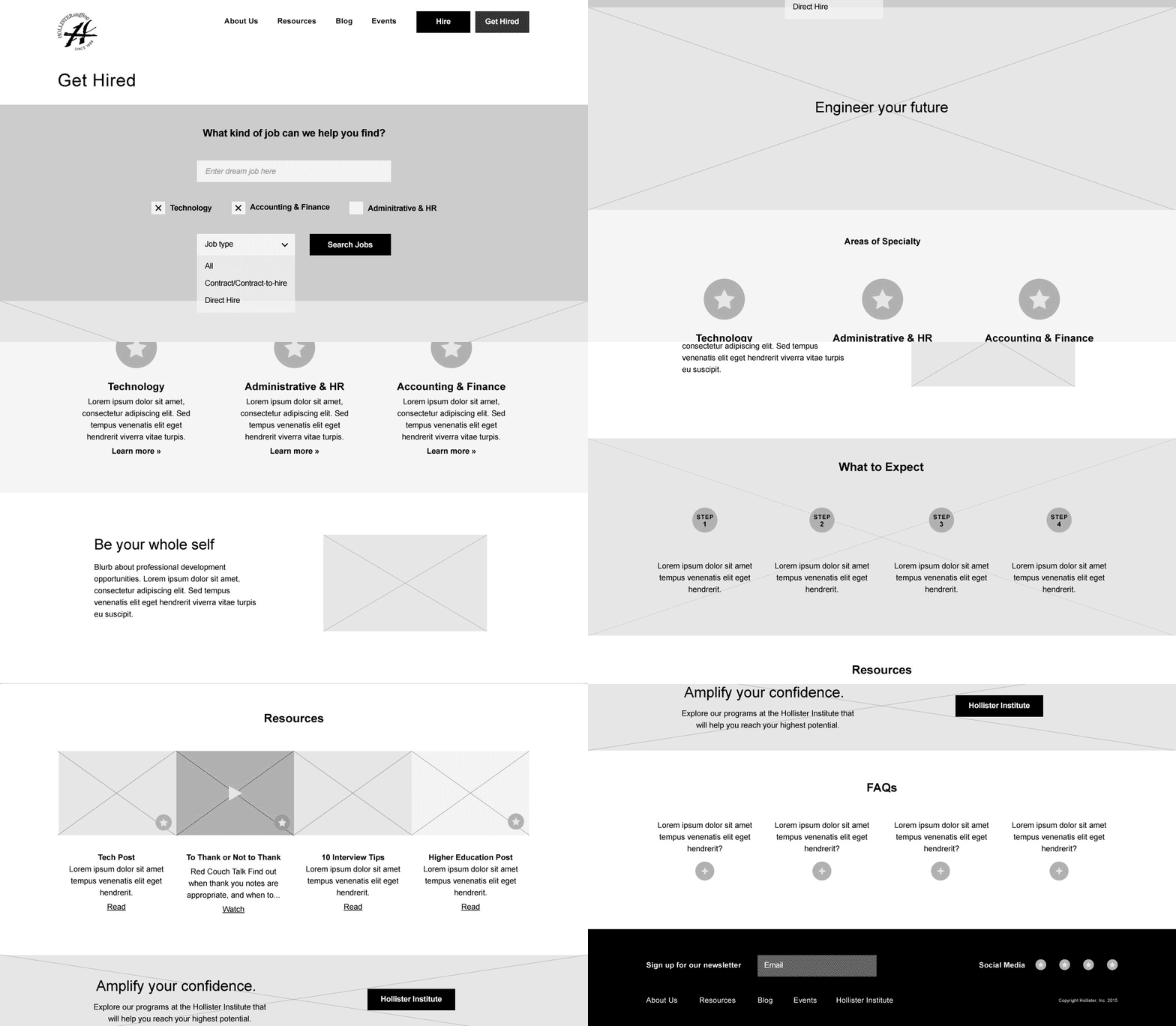
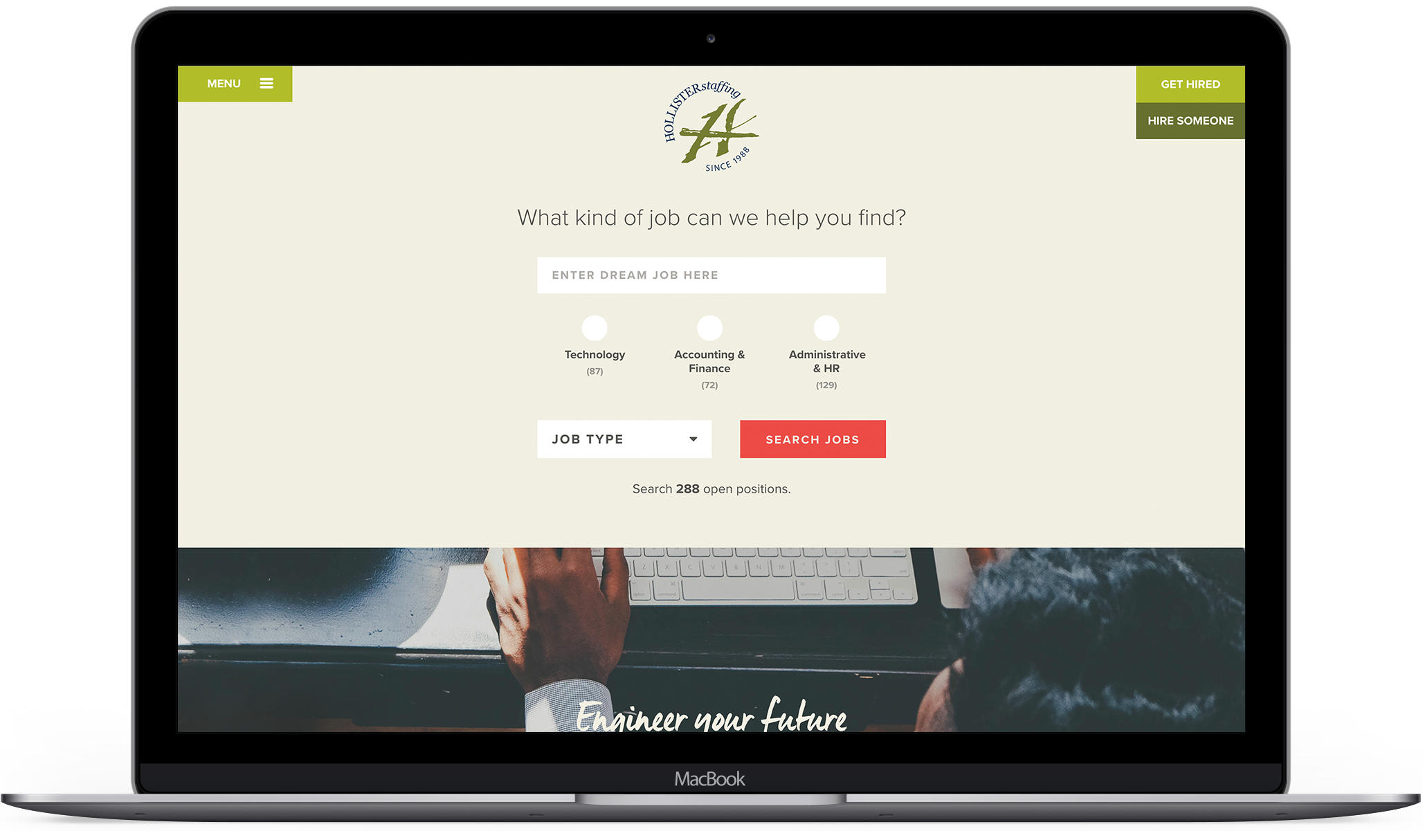
For example, we moved the job search out of the busy nav area where it was getting lost, to a prominent spot at the top of the Get Hired page. We followed that with sections about ‘What to expect from the job search process’, and resources for interviewees. This surfaced and decluttered the most pertinent content for candidates.
Voice
Challenge: Make a stressful and overwhelming experience feel exciting and encouraging
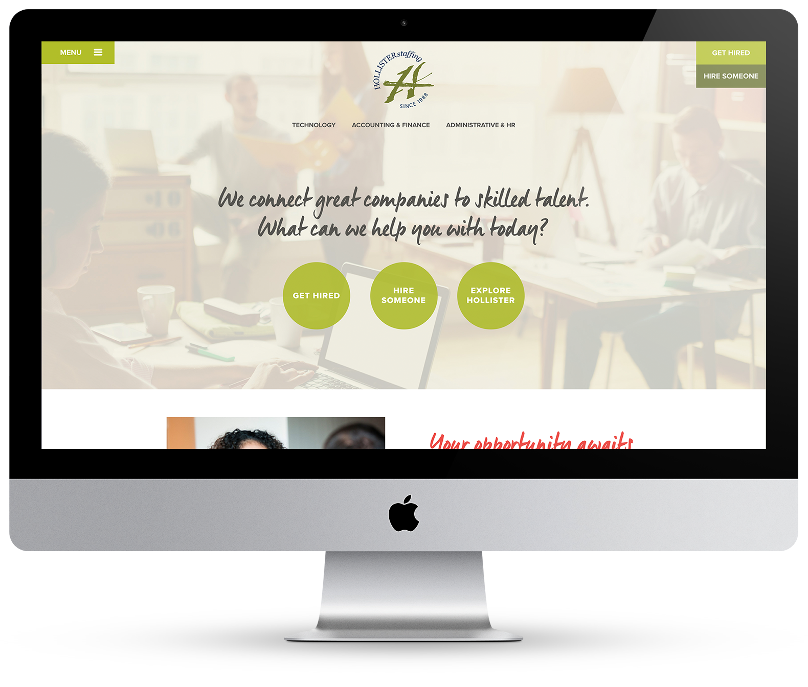
We understand your needs, and support your success
As opposed to touting all the merits of Hollister from their perspective, we recognized that their natural inclination to show care and support for employees, candidates and clients at every step should drive the web experience. Show, rather than tell, became our approach. We start by putting users in the driver’s seat: What can we help you with today?


An optimistic, empowering voice
After a competitive analysis of the industry, we realized no one was using narrative to connect with users. Job searching can be scary, but it also can be really exciting and the start of something new. We chose to focus on the excitement, to harness the good energy that is part of the process. We crafted an empowering voice that energizes candidates by looking optimistically to the future.
Visual Design
Challenge: Create a warmer, more inviting site experience while using the existing cool color palette

Creating a warm welcome
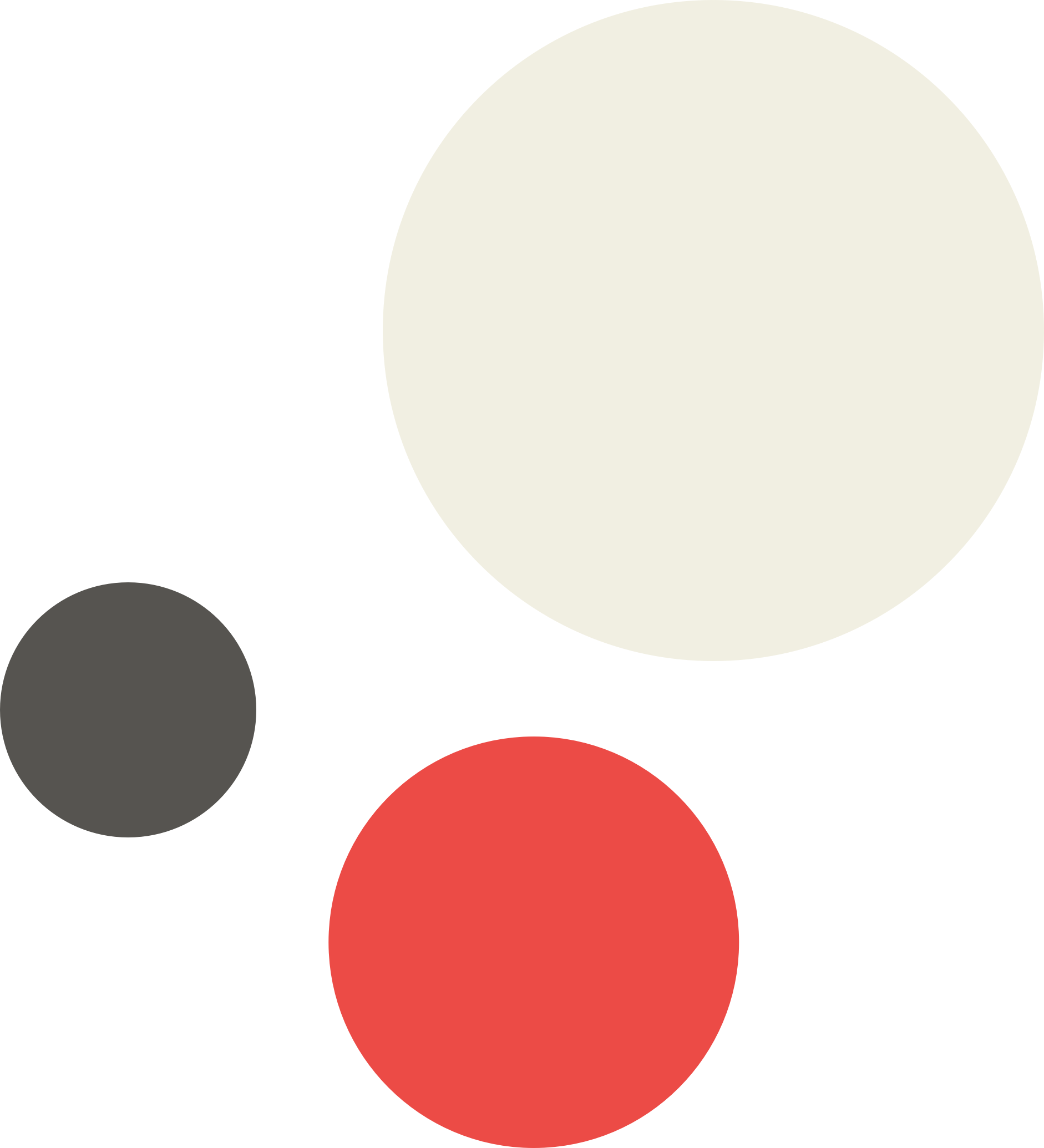
The existing site prominently featured a subdued color palette of navy, olive and grey, which felt heavy and flat. To brighten things up, we chose to make some additions to the color palette, and use the cooler colors more sparingly and intentionally. Inspired by a wall of flowers in their downtown office, I chose a lively red to add some oomph and contrast. A bright white background felt harsh, so we opted for a tan as the new backdrop.
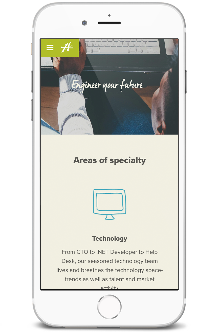
In need of a human touch
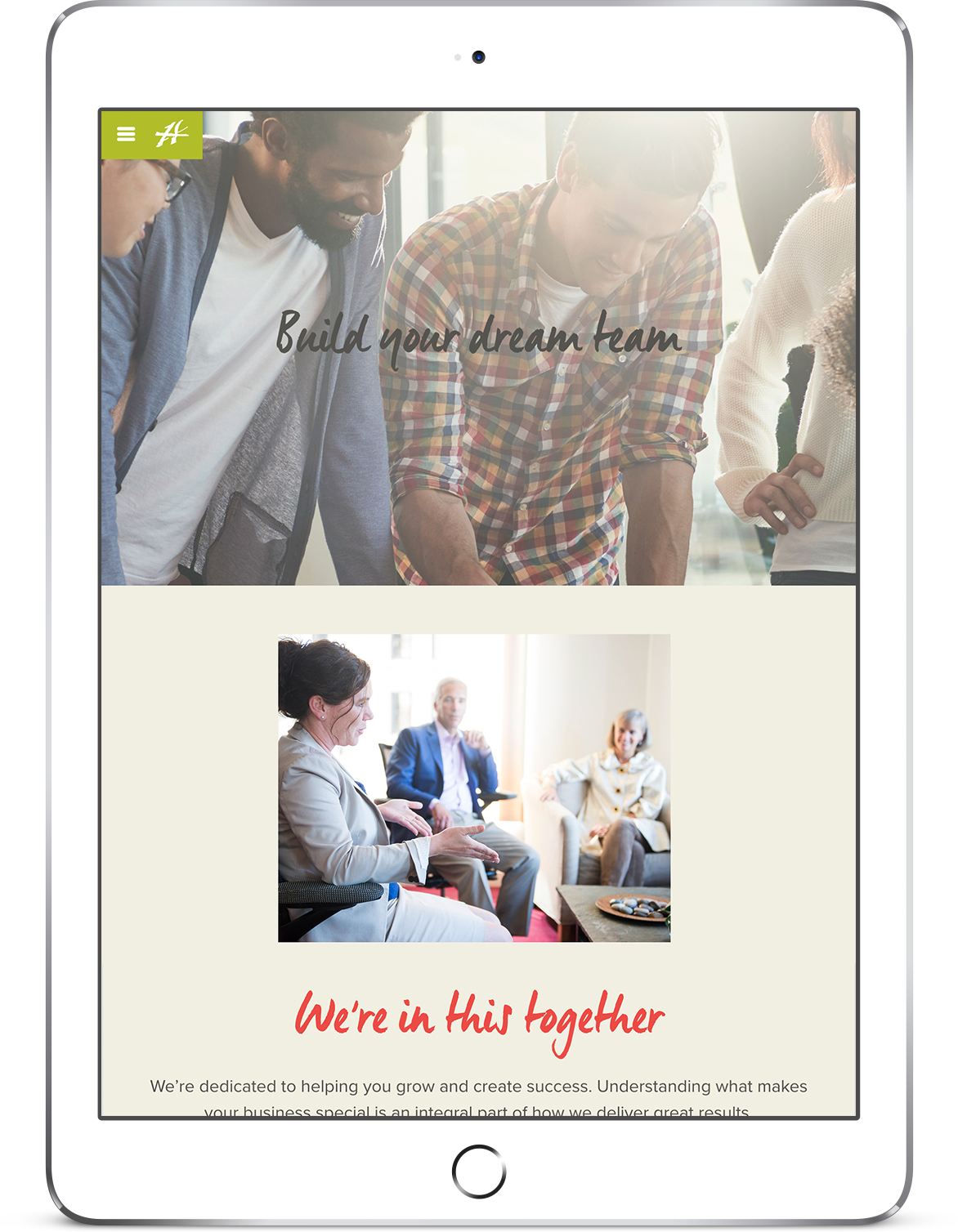
Void of photos and people, the site needed a human touch. With a plan to feature photography more prominently, we created a set of guidelines to align stock photos with original photography—natural lighting, smiling people, action and blurred foregrounds are unifying themes. A handwritten typeface for supportive messaging further humanizes the experience.
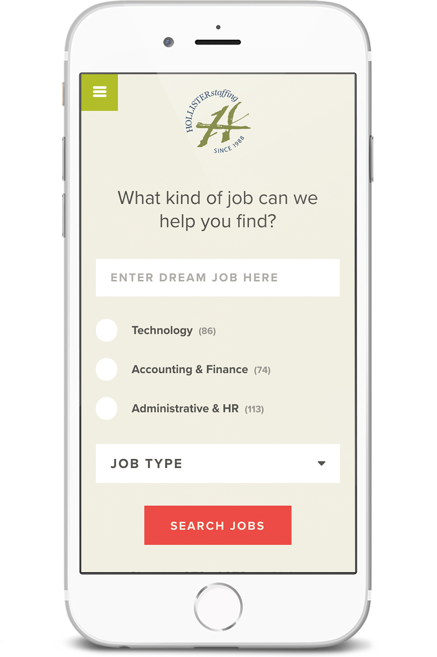
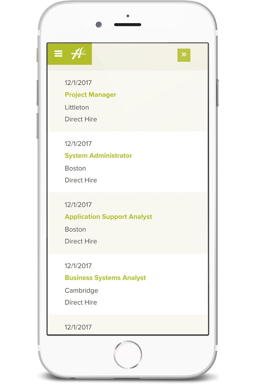
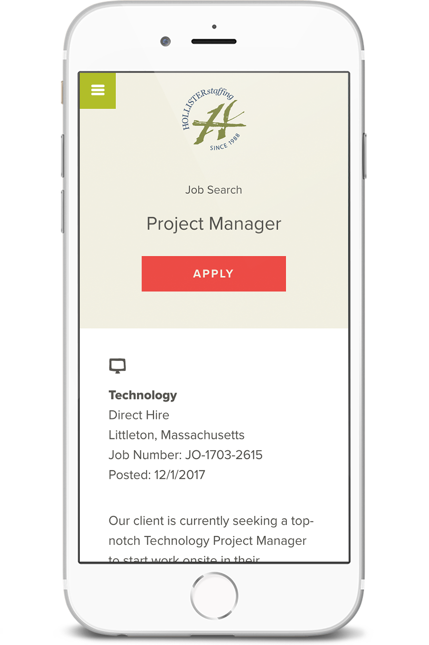
Another key component of making users feel more comfortable with Hollister was creating a cleaner job search process that was more fun to interact with. We designed the search interface to work more successfully on mobile, with form inputs that were easier to find and click. For a more consistent experience, we also customized the third party API that handles the search, and provided web formatting guidelines for recruiters to use when creating new posts.
Integrating the Hollister Institute
Challenge: Incorporate an unfamiliar offering into an established staffing business
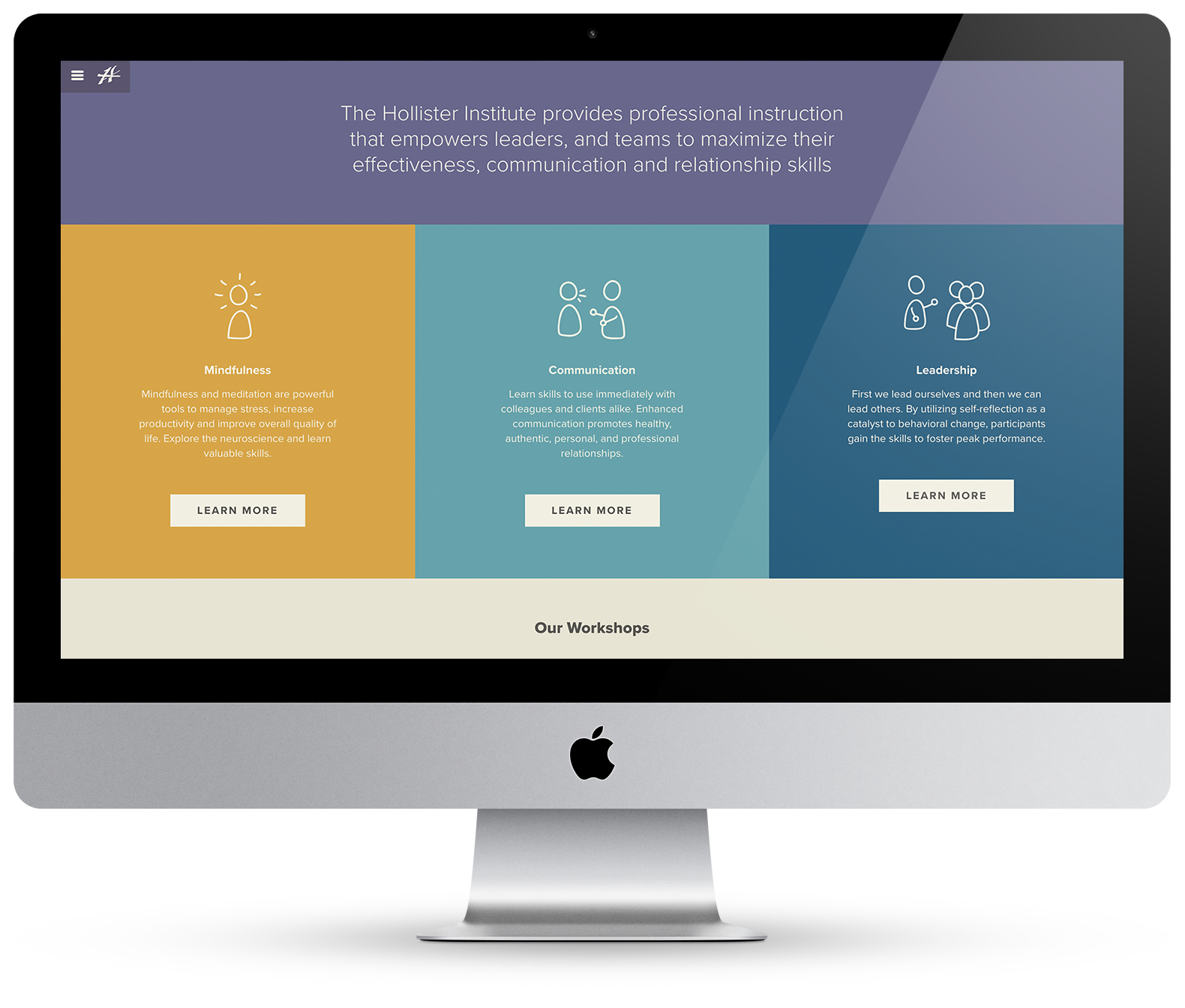
What is the Hollister Institute?
The Hollister Institute is a leg of the business that provides mindfulness, communication and leadership training. They provide a range of training programs in these areas, but had a difficult time organizing, promoting, and expressing the value of them to business partners and clients.
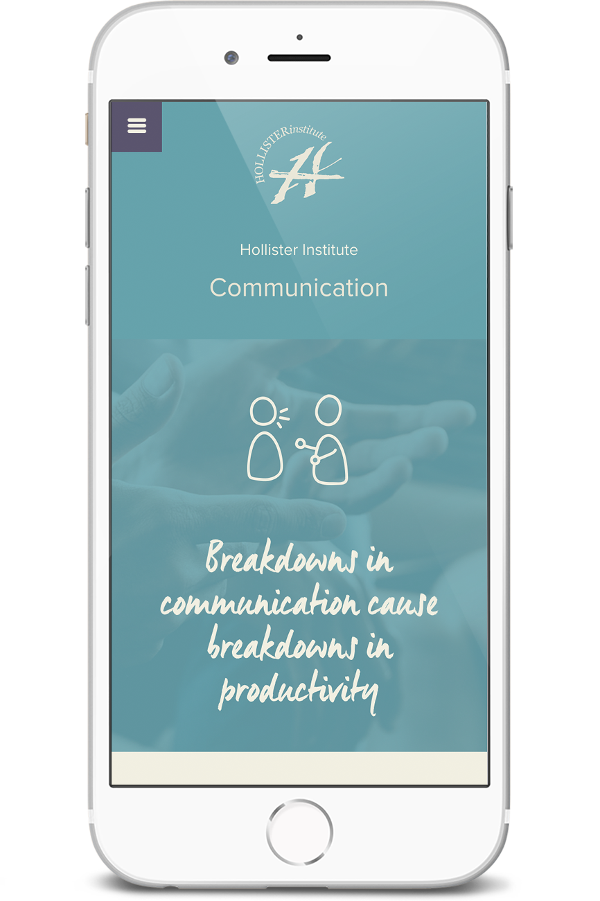
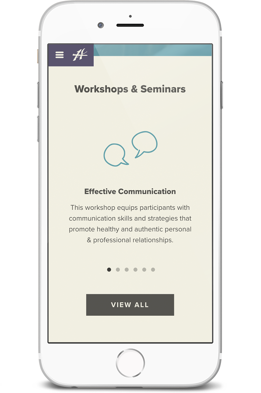
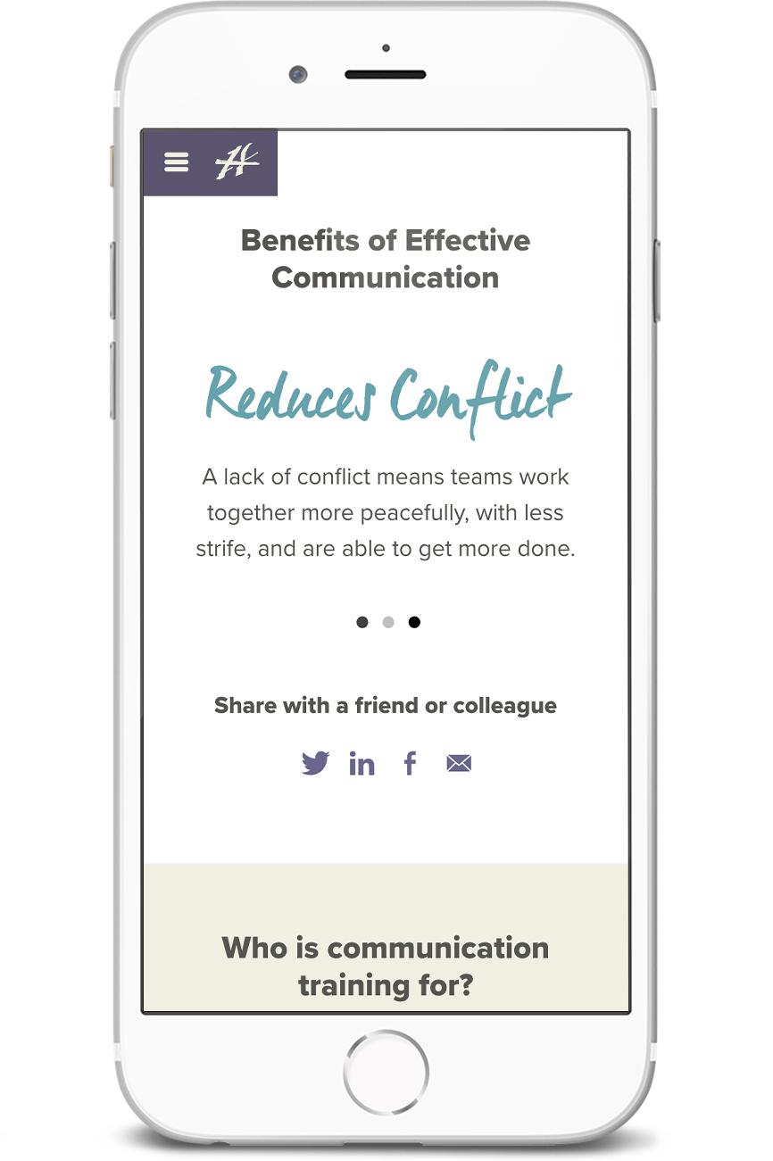
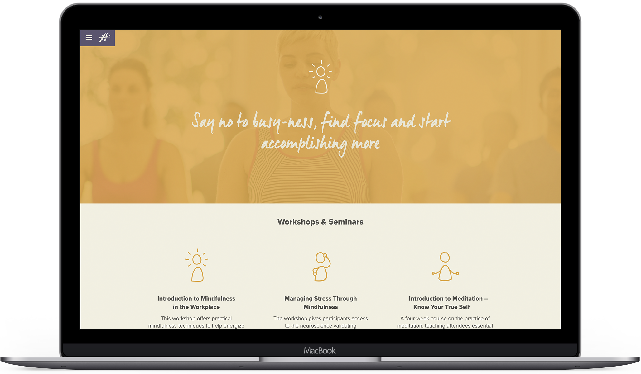
Because the concepts and methods explored in their workshops are best understood through experience, we avoid getting into the details of the methodology. Instead, we highlight the business and personal benefits of the training.
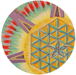

What does the Hollister Institute look like?
As a separate section of the business, the Institute needed its own identity, but also maintain continuity to the main site. We repurposed UI patterns from the Staffing site, adopting a new color palette to differentiate the two. In early Institute communications, the company's founder and CEO had used purple from a mandala painting she had hanging in the meditation room. We retained this purple, and rounded out the rest of the palette by drawing other hues from the painting. The result is calm and inspires trust.
Communicating hard-to-grasp ideas
Evoking ideas like mindfulness, leadership, and communication through photography can become repetitive and meaningless (i.e. business people smiling in front of a wall of post-its). Instead, I created a series of figure illustrations to express these themes at a glance. They are casual doodles, bringing a human touch to the page.
Results
Our initial site redesign led to 20% more conversions, and an increase in candidates, job applications, and returning visitors.
“Thank you. For all the work, ideas, creativity, listening, capturing of concepts and culture. For the technological ability to create, rejigger and problem solve. For helping us reach a new level in our web presence.”
- Client
Selected Works
Design SystemProduct Design
Compensation ToolData & Analytics Product Design

Hollister Staffing + InstituteWeb Design

DogWatchWeb Design

Broker WebsiteWeb Design
Give me a holler
© 2018 Emily Hamre
