Description
The client, a buyer and seller of online businesses, came to us in need of a new website that would match the level of professionalism their clients had come to expect. Having outgrown the current site, their team needed a more specialized platform that could streamline their day-to-day work and provide a high quality experience for users. This included designing a secure client area, making better use of user data, capturing more desirable leads, and featuring their growing content.
This project required extensive wireframing and prototyping to ensure all data paints and interactions were consistent throughout. Information hierarchy was key to communicating with the distinct user types, Buyers and Sellers.
Project Duration: Five months
Please note some content has been replaced for privacy.
Project Role
Design Research
Concept
Information Architecture
User Experience
Wireframing
Prototyping
Visual Design
Asset Production
Specifications & Pattern Guide
Project Management
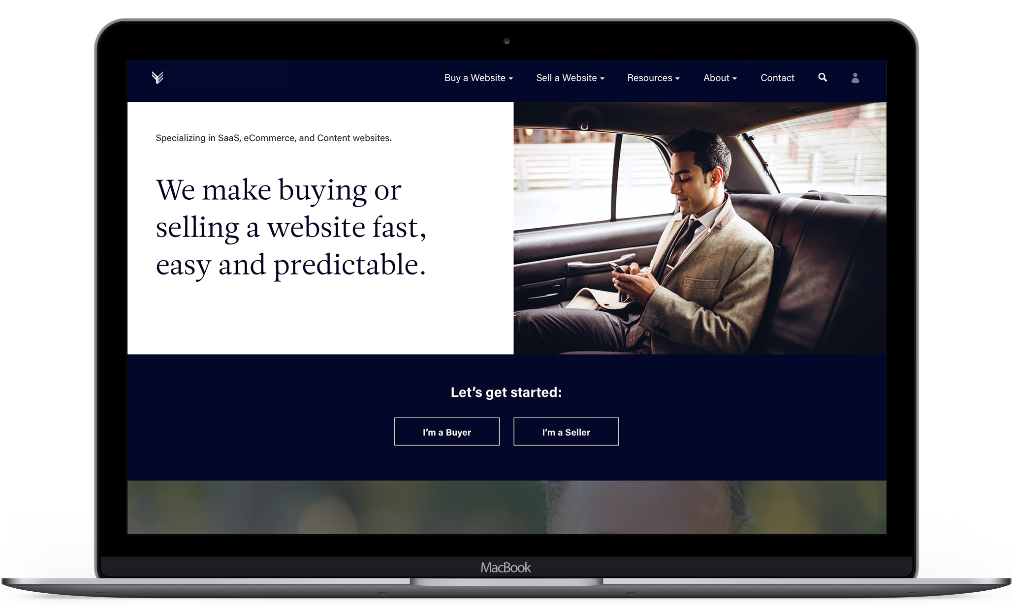
User Flow
Challenge: Incorporate new content into a more robust experience for users, while boosting the quality of conversions
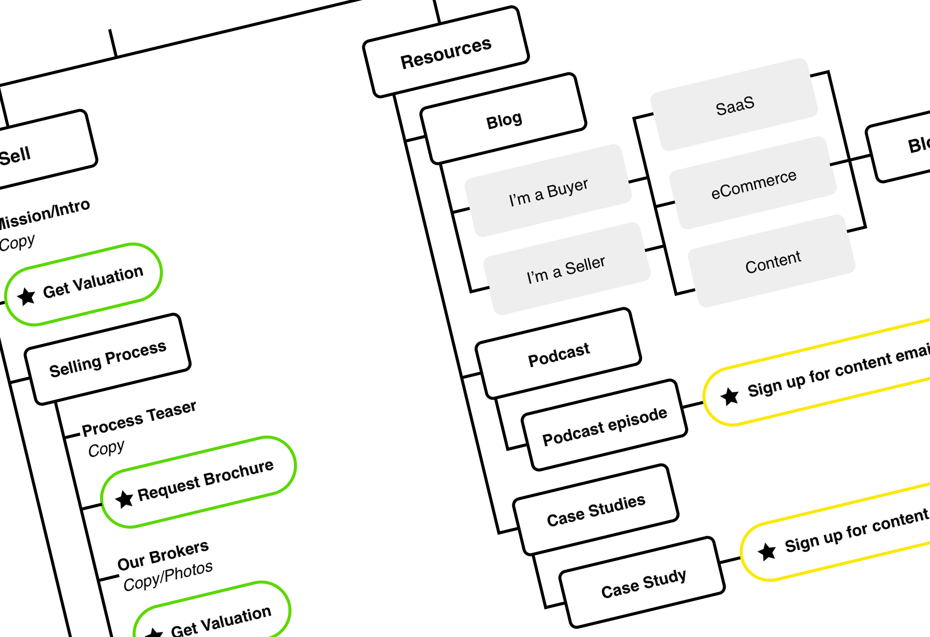
Site reorganization
For their new site the client went through a major restructuring of content, which we organized into new sections on the site. The goal was to create more robust areas for the primary user groups, Buyers and Sellers. We also created a new Resources section to feature their high-traffic blog content. By incorporating the new content into the sitemap we could look for conversion opportunities throughout the site.
Exploring user paths
We also used the sitemap as a roadmap of content to explore how information might be consolidated or broken up to best present the complex processes of their business. We identified the various paths users might take through the site, and what information each user type needs and when. From here we adjusted the flow to both educate newer users and give direct access to high-priority actions for returning users.
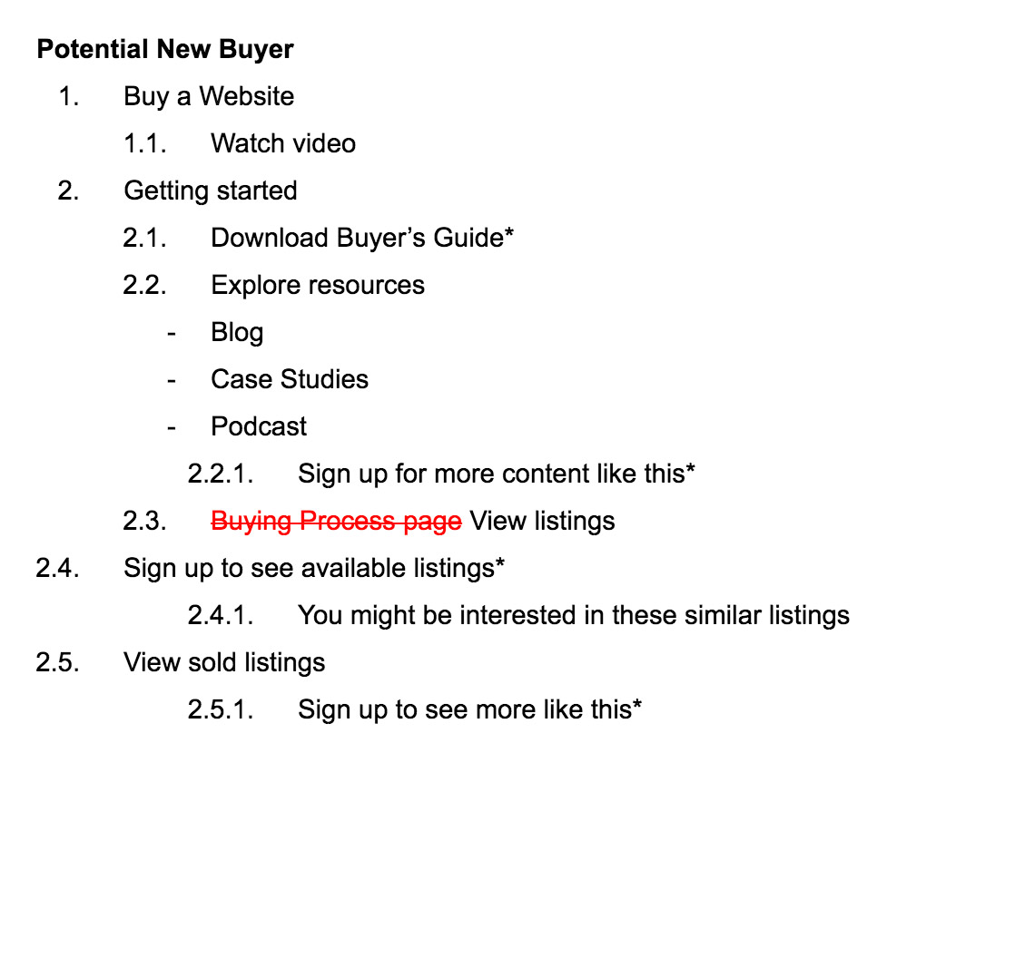
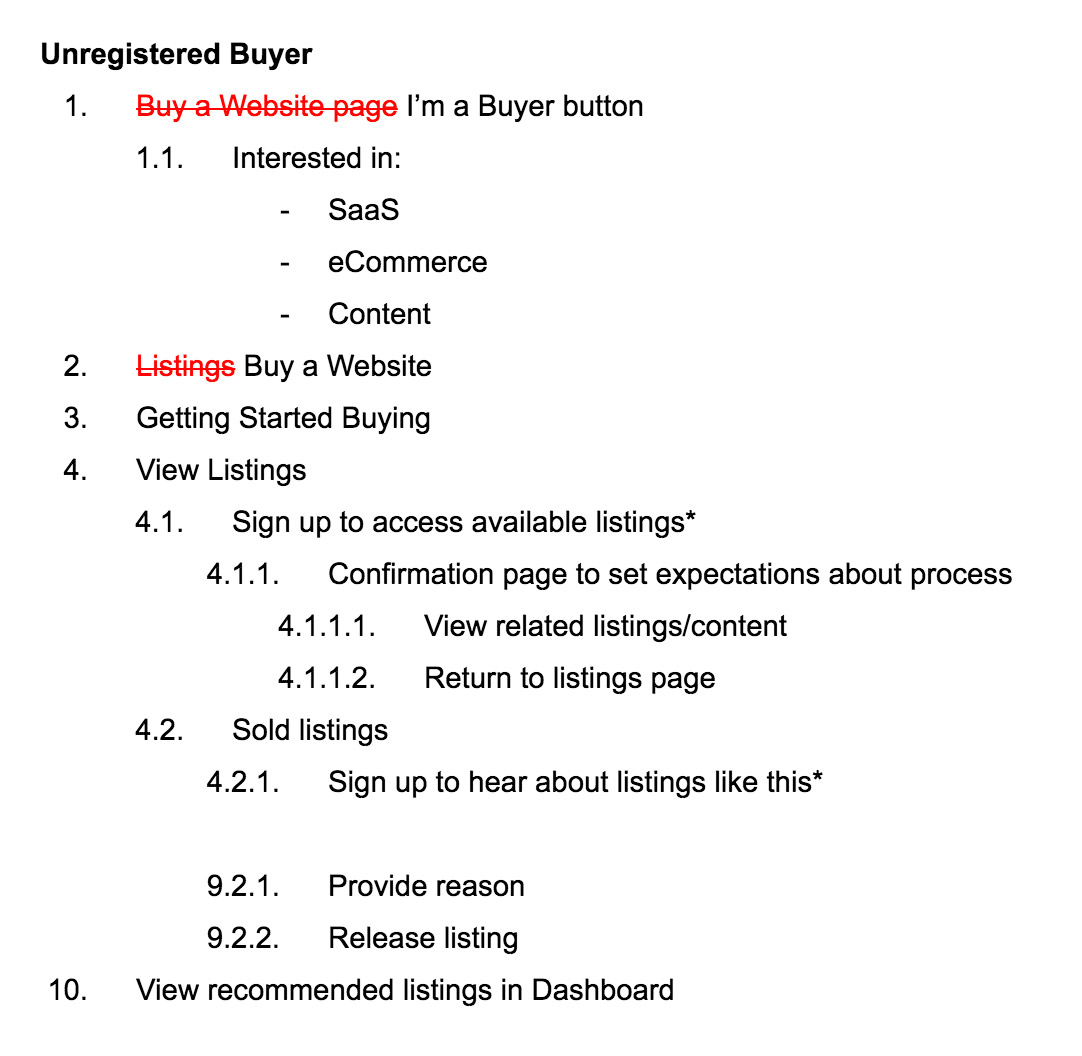
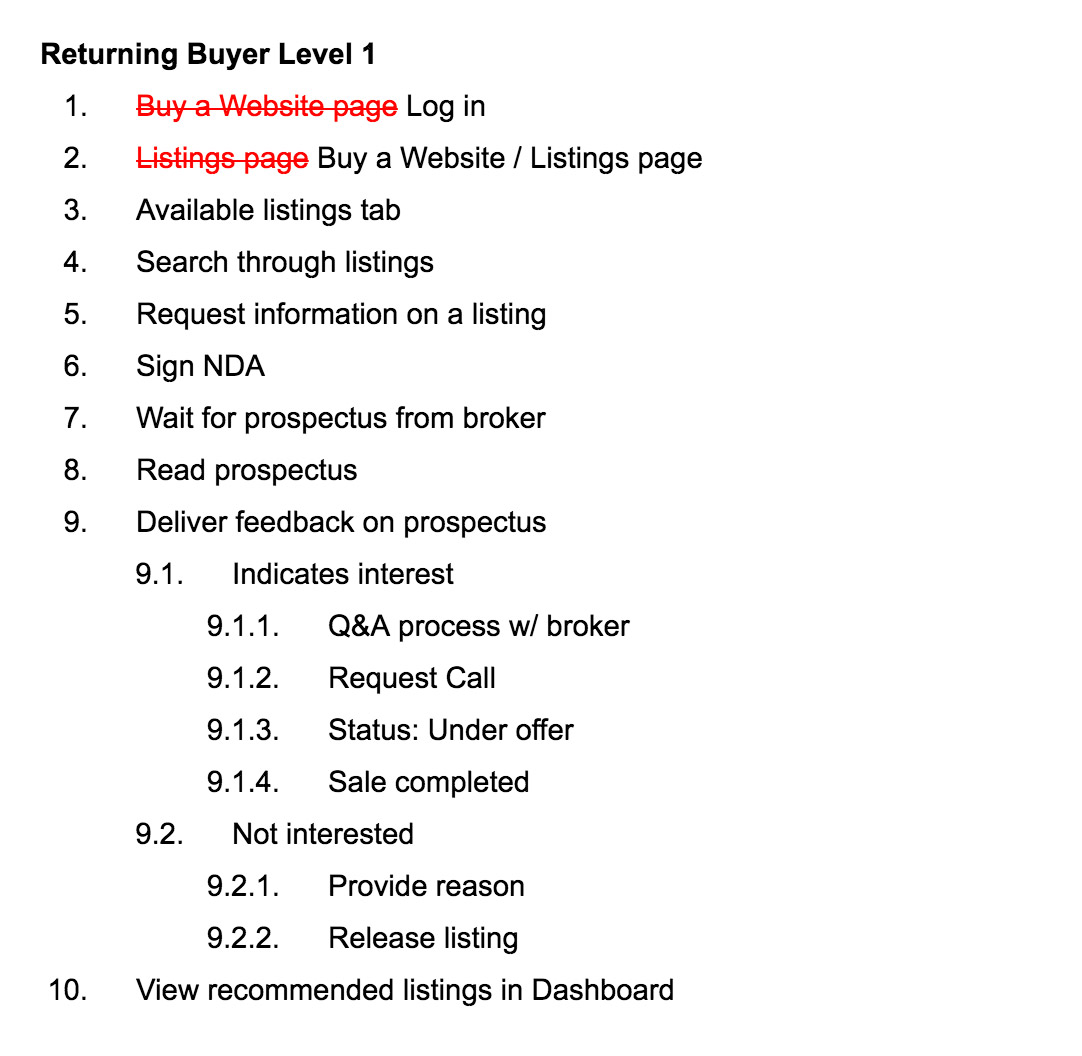
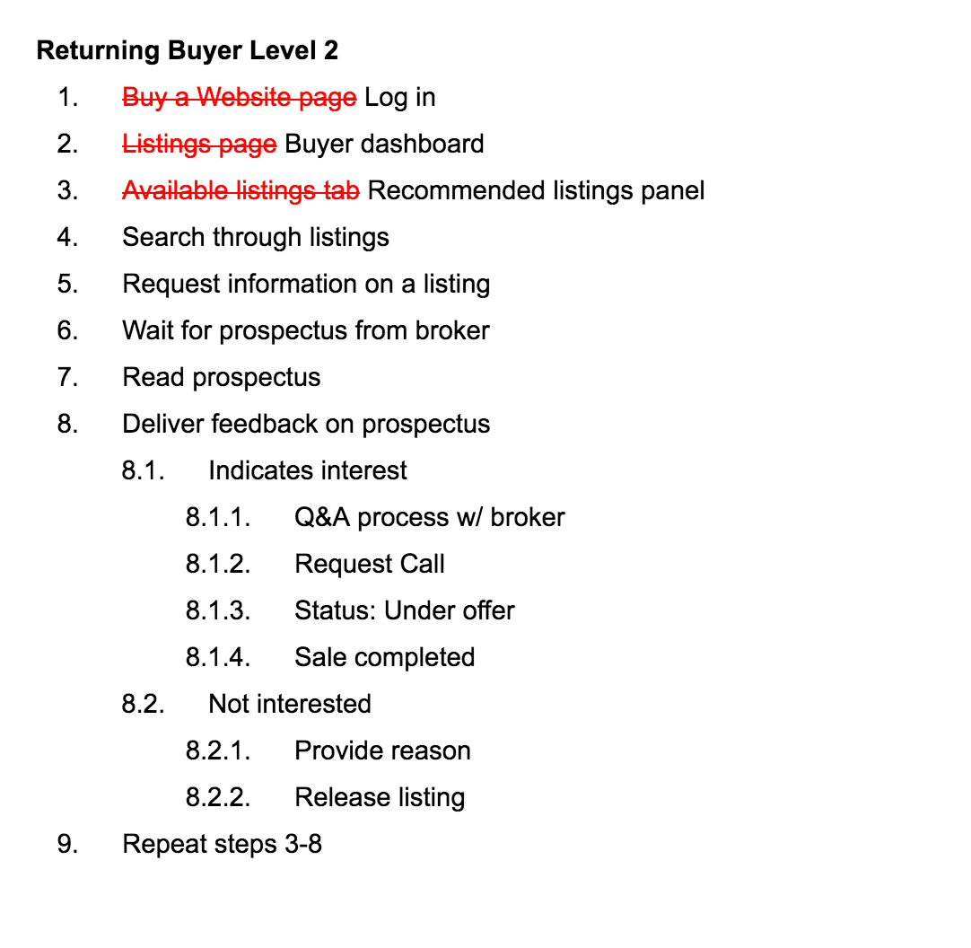
User Path Exploration
Capturing higher quality leads
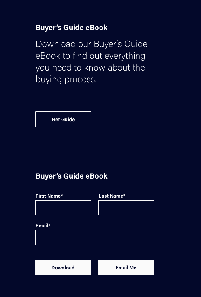
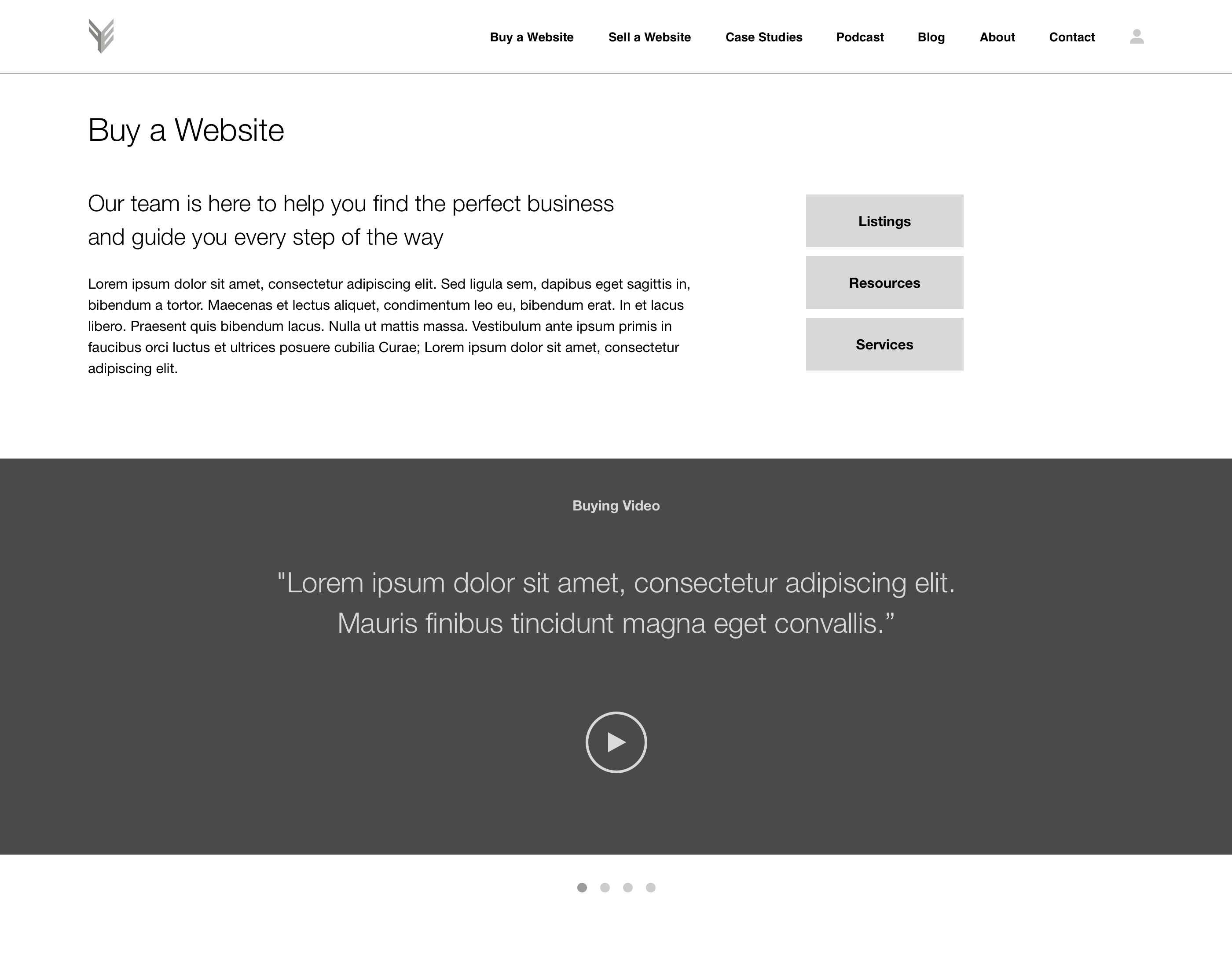
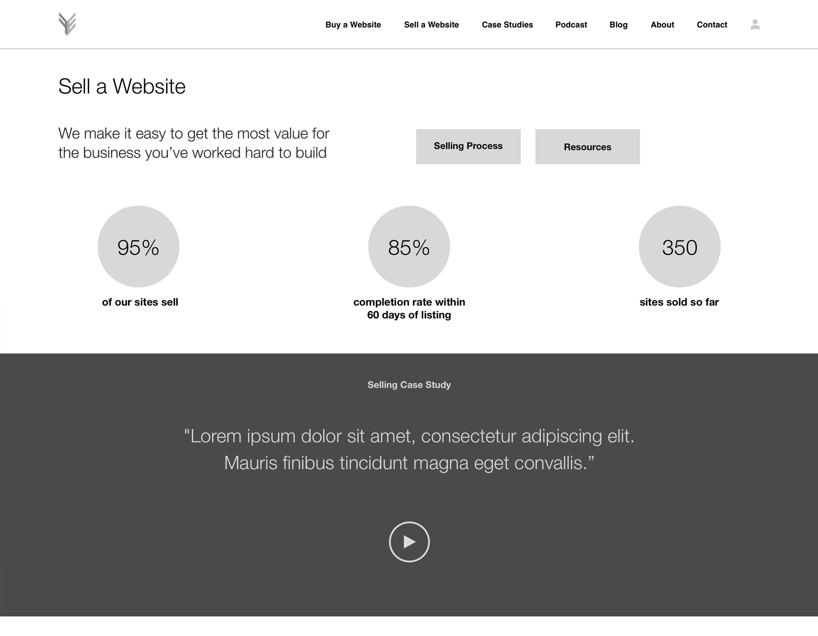
The existing site prompts users to sign up first thing upon entering the site. This garnered a lot of leads but not necessarily those of high quality, which was not efficient for the client's growing team. By pushing the conversion opportunities farther into the site we gain more specificity in data and capture users that have both learned more about the company and have devoted more of their time, establishing a higher level of commitment.
Rethinking our approach
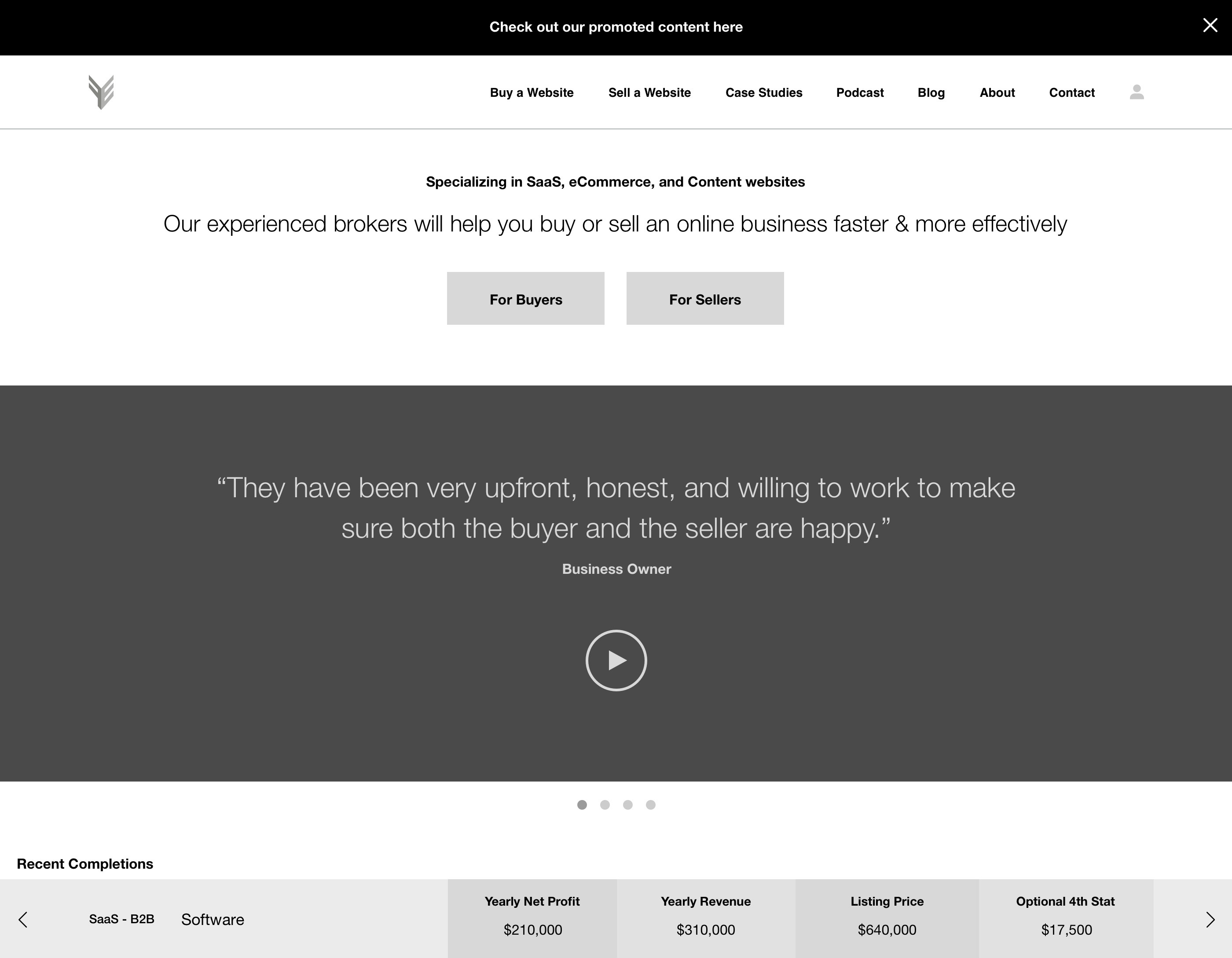
Initially, we led users directly into the new Buyer or Seller areas of the site and where they could select which action they'd like to take next. However, we determined this approach relied on users knowing exactly what they wanted to do upon entering the site, which was not always the case. To remedy this, we layered information in a series of pages that get more detailed as users move through. This approach also aligned with our goal to move conversions further into the user paths.
User Experience
Challenge: Produce a seamless, personalized experience for users
A tailored experience
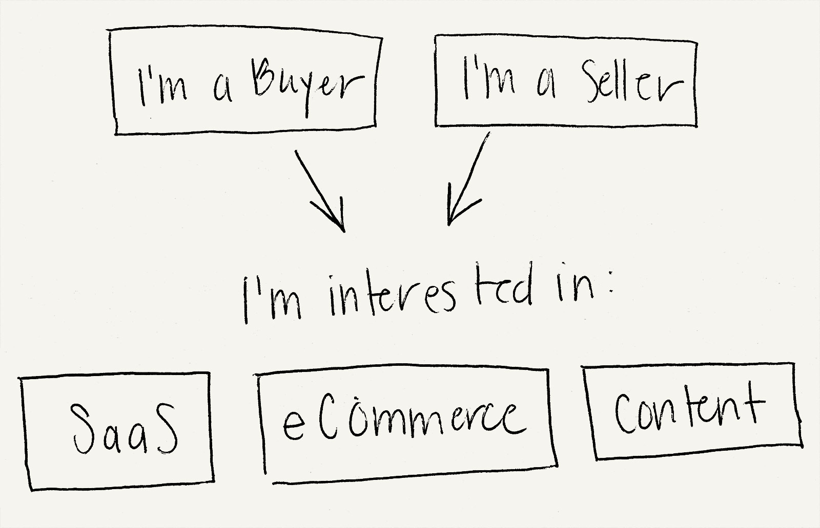
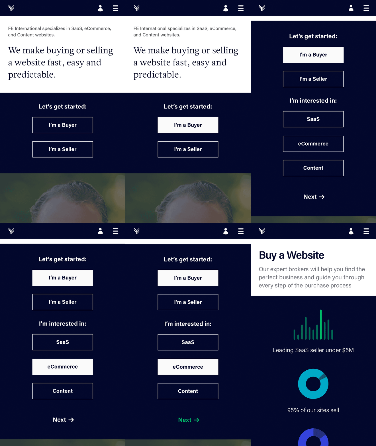
Upon entering the site, we prompt users to self identify and select their interests, thereby making the experience feel personalized right away. These data points are then used to curate content throughout the site. By prompting users to go to each next step we guide them through the process, creating a sense of ease and confidence.
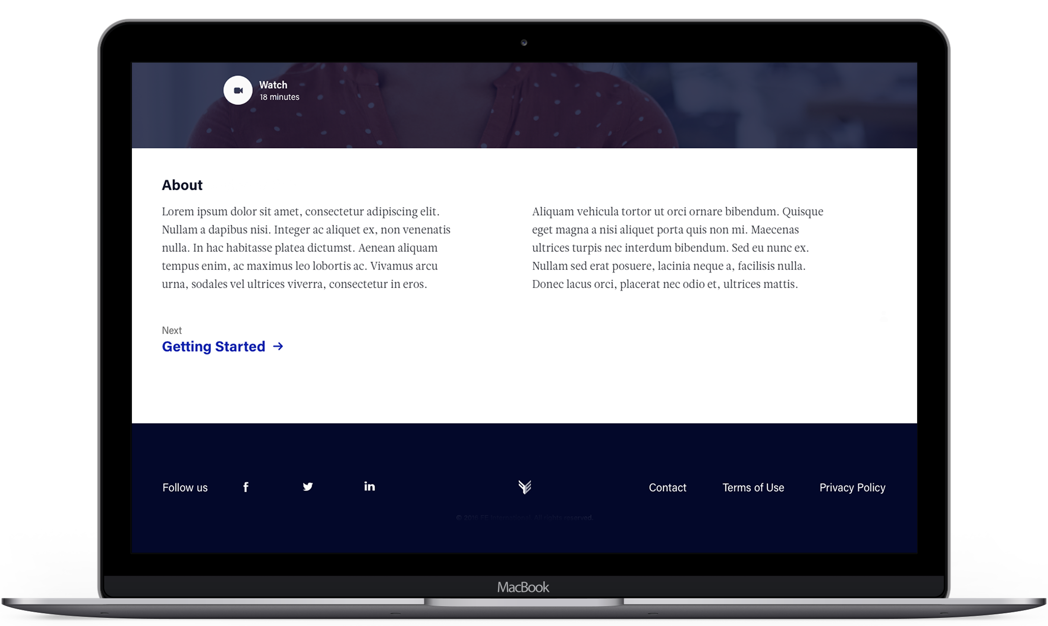
Smooth interactions
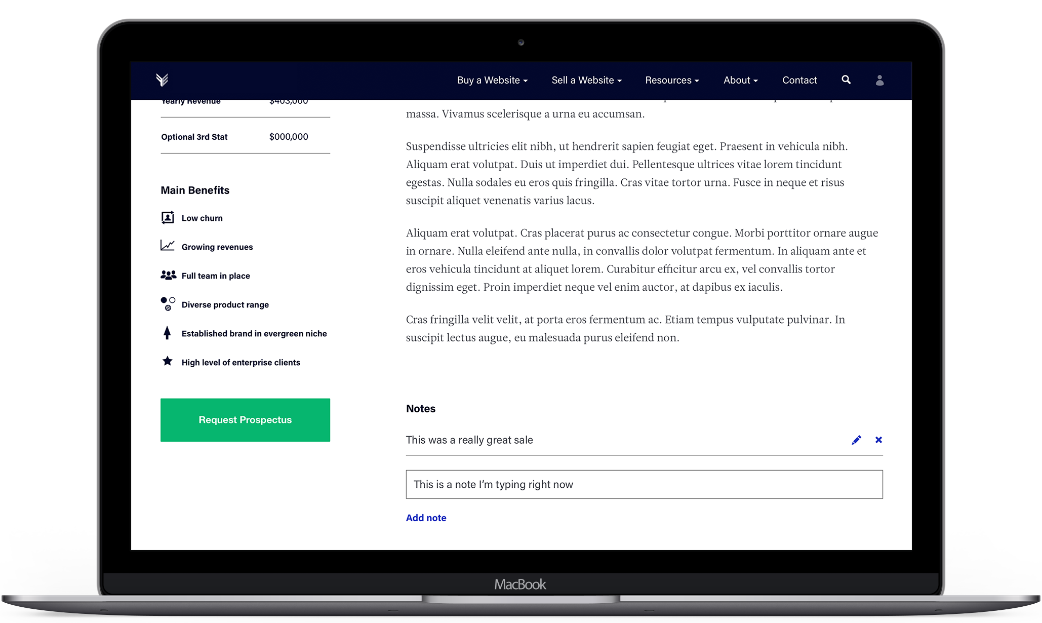
Particular attention was paid to making all interactions happen within one screen, so as not to disrupt the user's experience. Downloads, sign-ups and primary Buyer/Seller interactions were all designed to be quick and fluid.
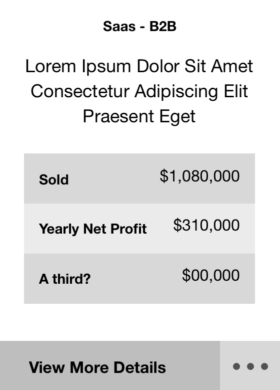
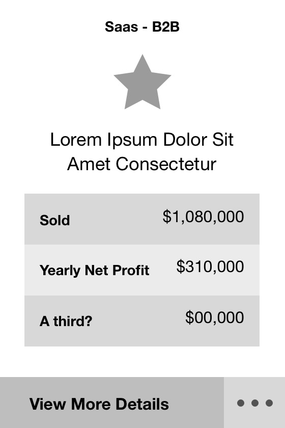
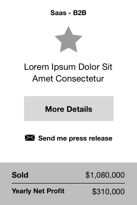
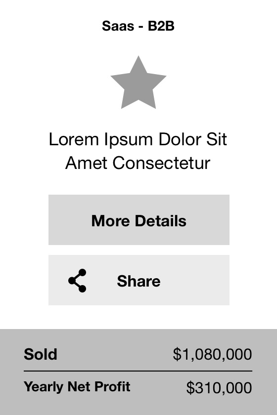
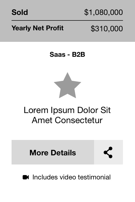
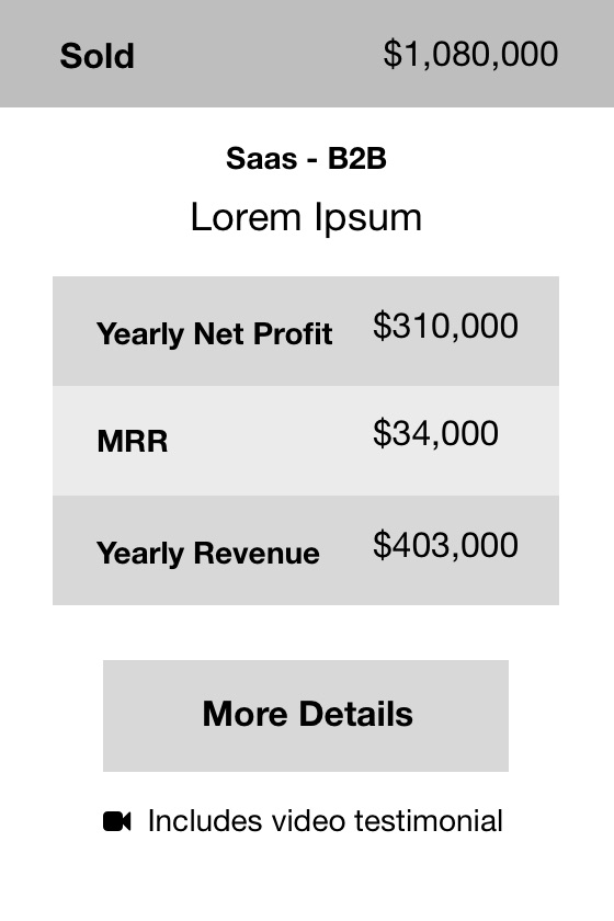
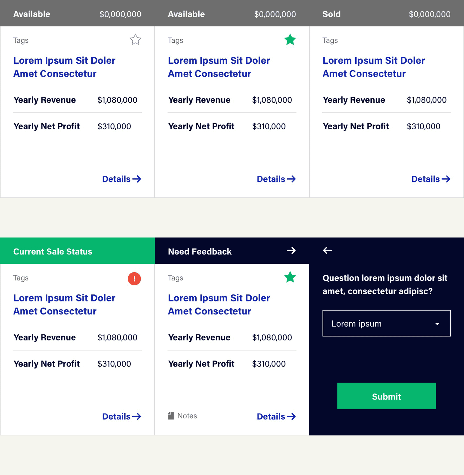
Listing design
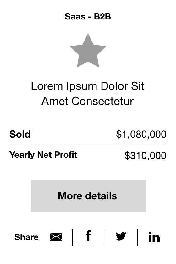
Listing cards are at the heart of multiple steps in the buying process, and need to clearly display key information and accomodate different interactions at each stage. We went through many iterations to find a design that could integrate all of these requirements.
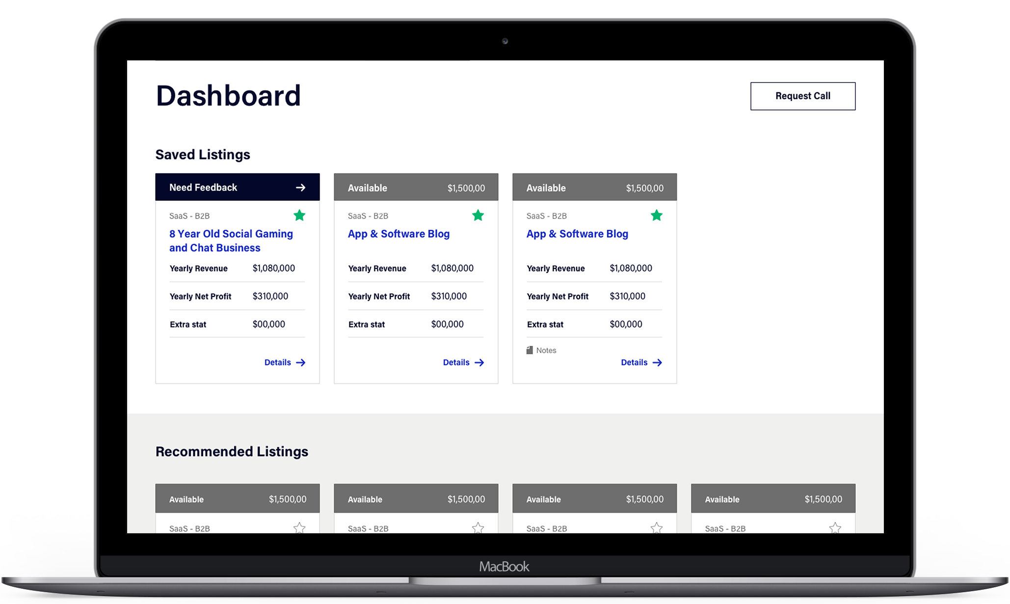
Final listing design
Visual Design
Challenge: Create a professional web presence to reflect the way they do business
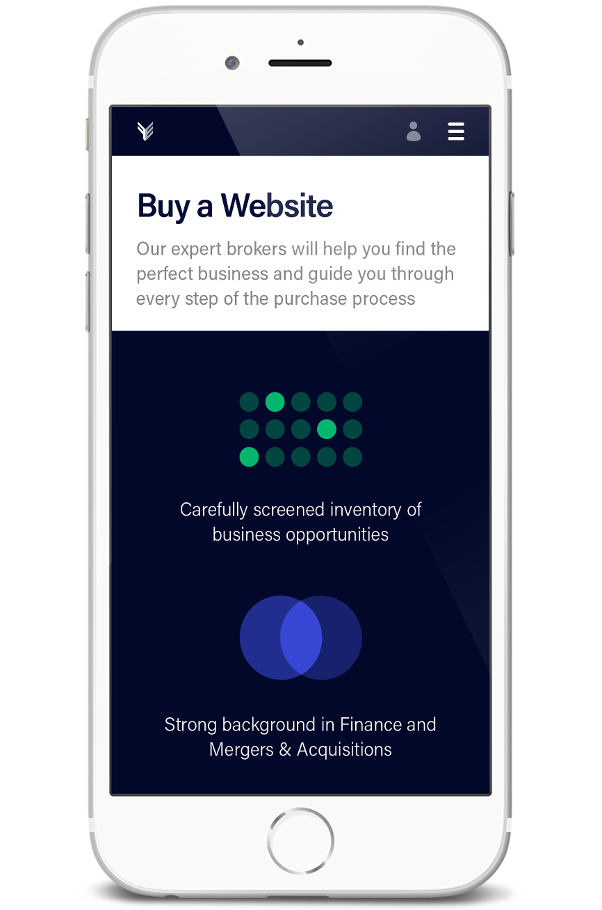

Colors
Deep indigo brings a much-needed feeling of legitimacy and professionalism to the existing color palette of bright blue and green. The color implies luxury and ambition, reflecting the aims of users. For continuity, blue and green are maintained as accent colors.
Imagery
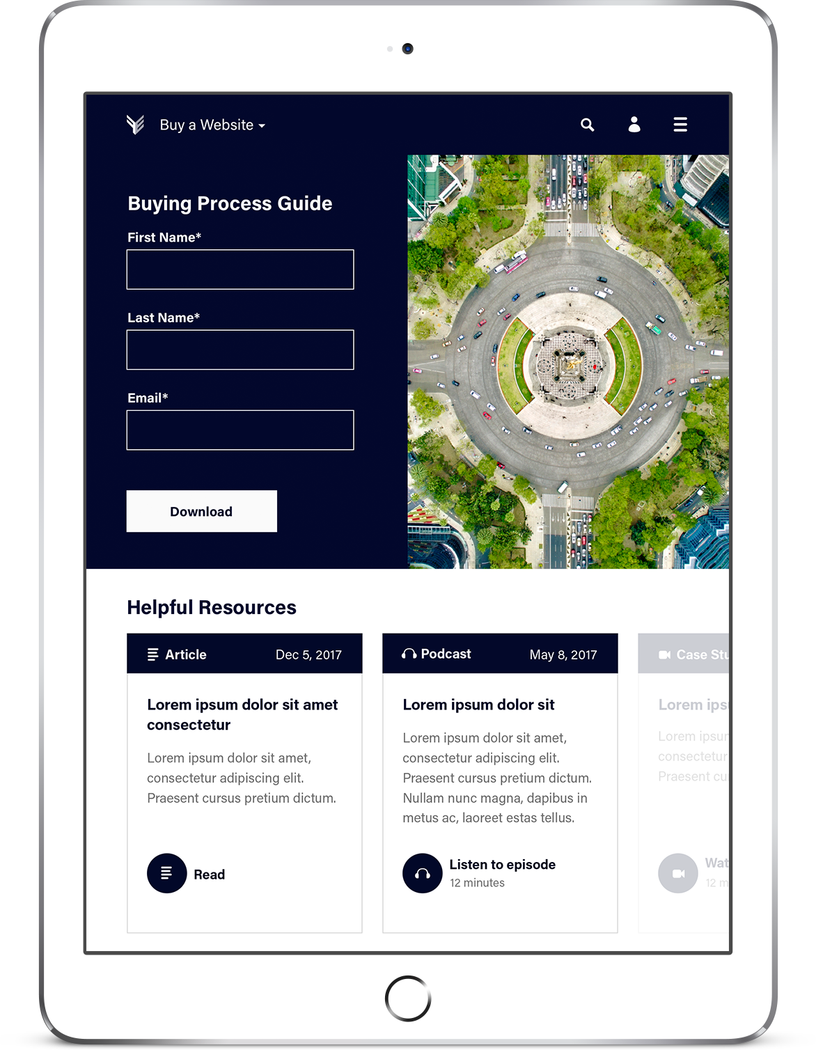
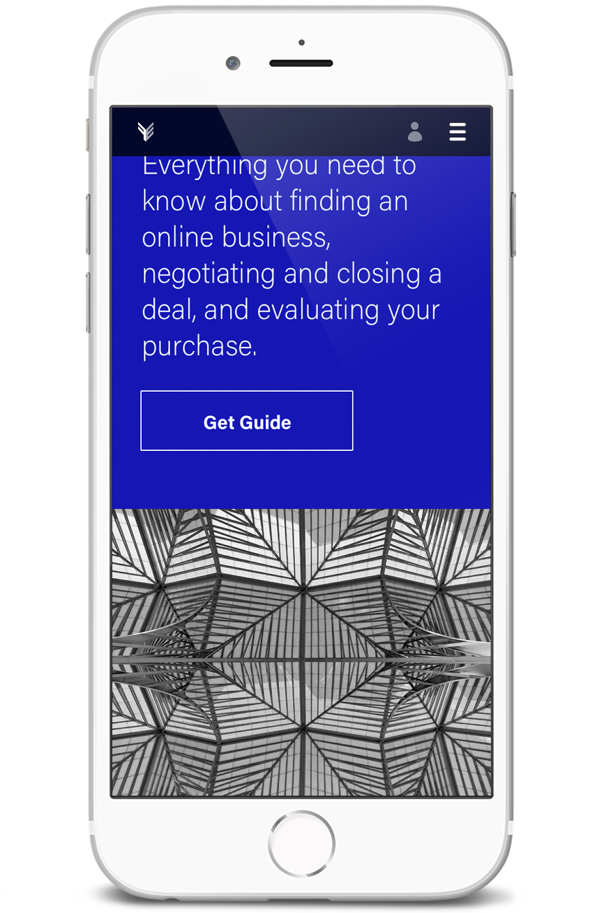
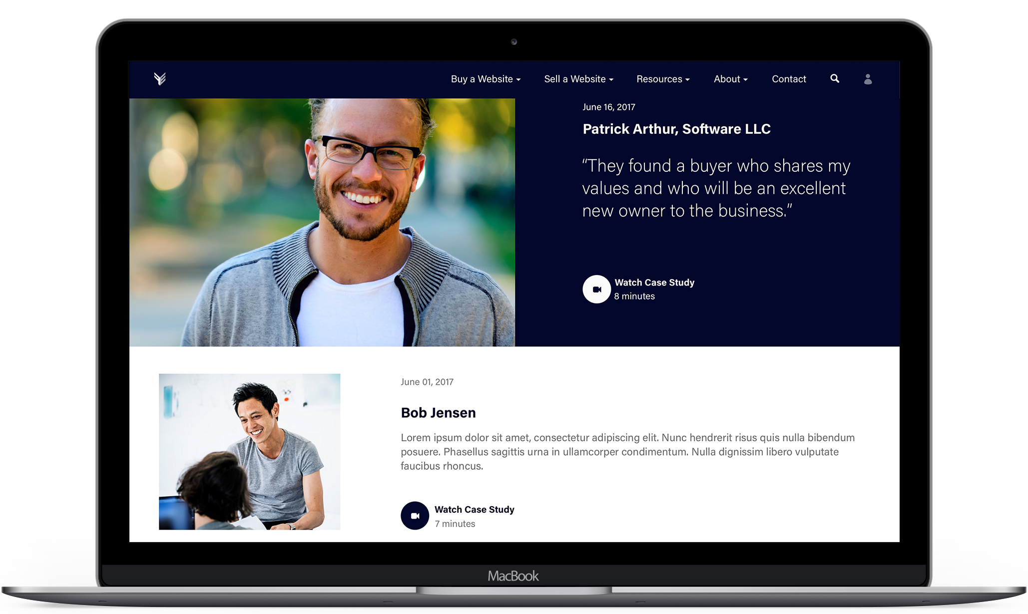
As an international business, photography needs to resonate with aspirations across cultures. Photos of locations across the globe build energy and inspire trust. Using artistically composed images with unique perspectives reflects a tailored, high-end service. Images with high intensity colors and contrast project confidence.

Type
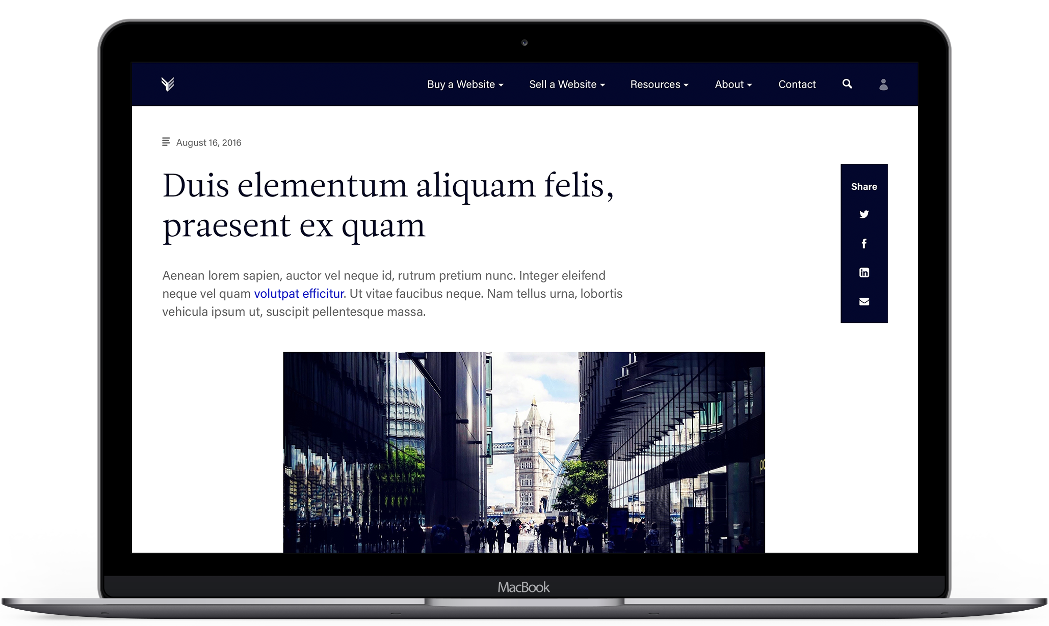
Leitura News has an editorial flair that reinforces the thought leadership demonstrated in the client's extensive resources. Acumin Pro is a solid companion, adding visual relief from the serif and offering legibility in the detailed listings. Together the typefaces bring much-needed legitimacy to the site.

Result
A flexible platform that can grow with the company, becoming more customized they gather data; a professional website that will attract high-quality leads.
Selected Works
Design SystemProduct Design
Compensation ToolData & Analytics Product Design

Hollister Staffing + InstituteWeb Design

DogWatchWeb Design

Broker WebsiteWeb Design
Give me a holler
© 2018 Emily Hamre
