Description
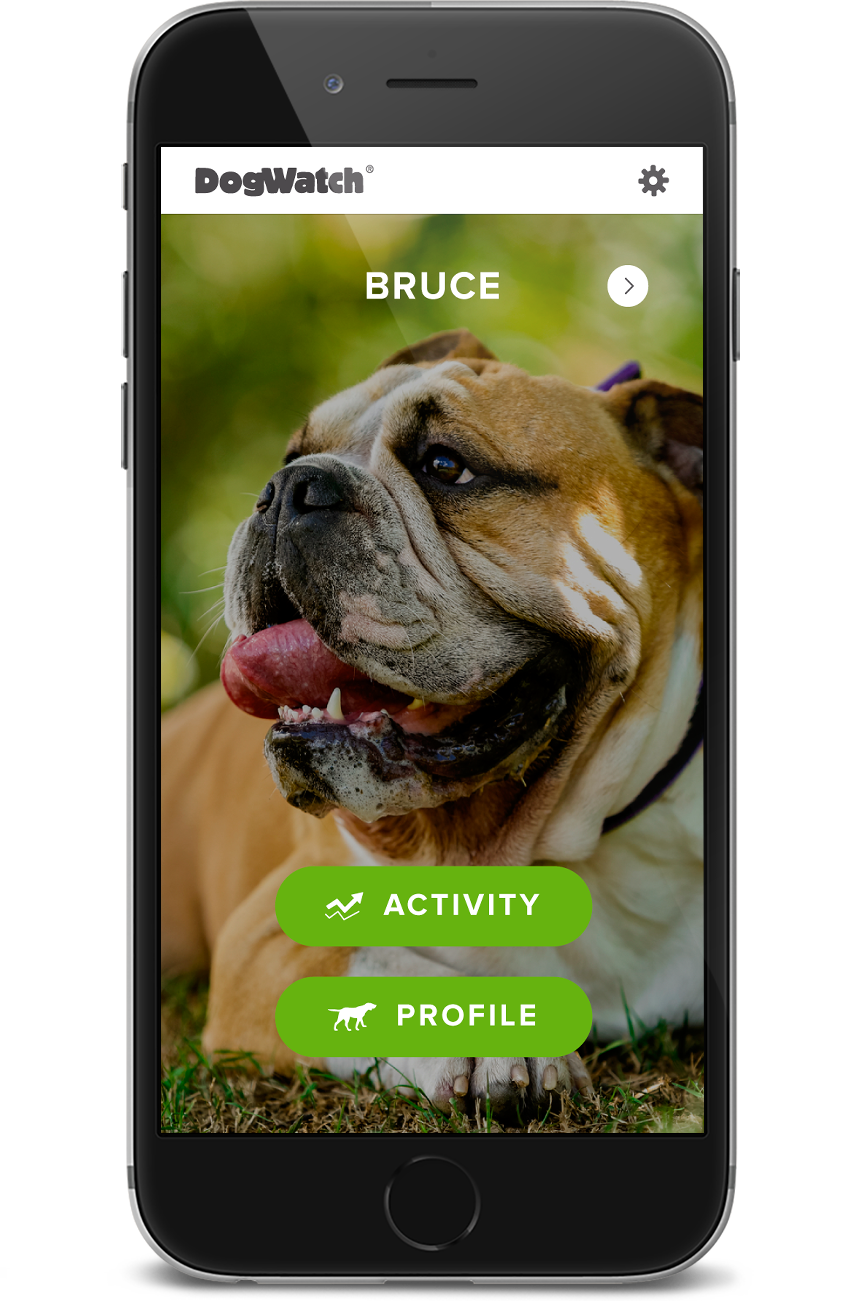
For the past four years I have been a part of ongoing work to enhance DogWatch's web presence and evolve the brand. Working from their existing brand elements I created a design system which was implemented across their digital platforms including the corporate website, a website for a new product line, the network of 120+ dealer websites, an app, and eventually print and marketing materials.
Our team worked closely with the team at DogWatch to coordinate product launches, respond to evolving needs of dealer network, and improve SEO and web experience. My role was primarily focused on improving UX/UI, storytelling, and coordinating the brand across platforms.
Project duration
One year for initial creation and implementation of design system + incremental updates over the following three years
Project Role
Design Research
Information Architecture
User Experience
Wireframing
Prototyping
Visual Design
Storytelling
Branding
Custom Graphics
Asset Production
Specifications & Pattern Guide
Content Population
QA Testing
Project Management

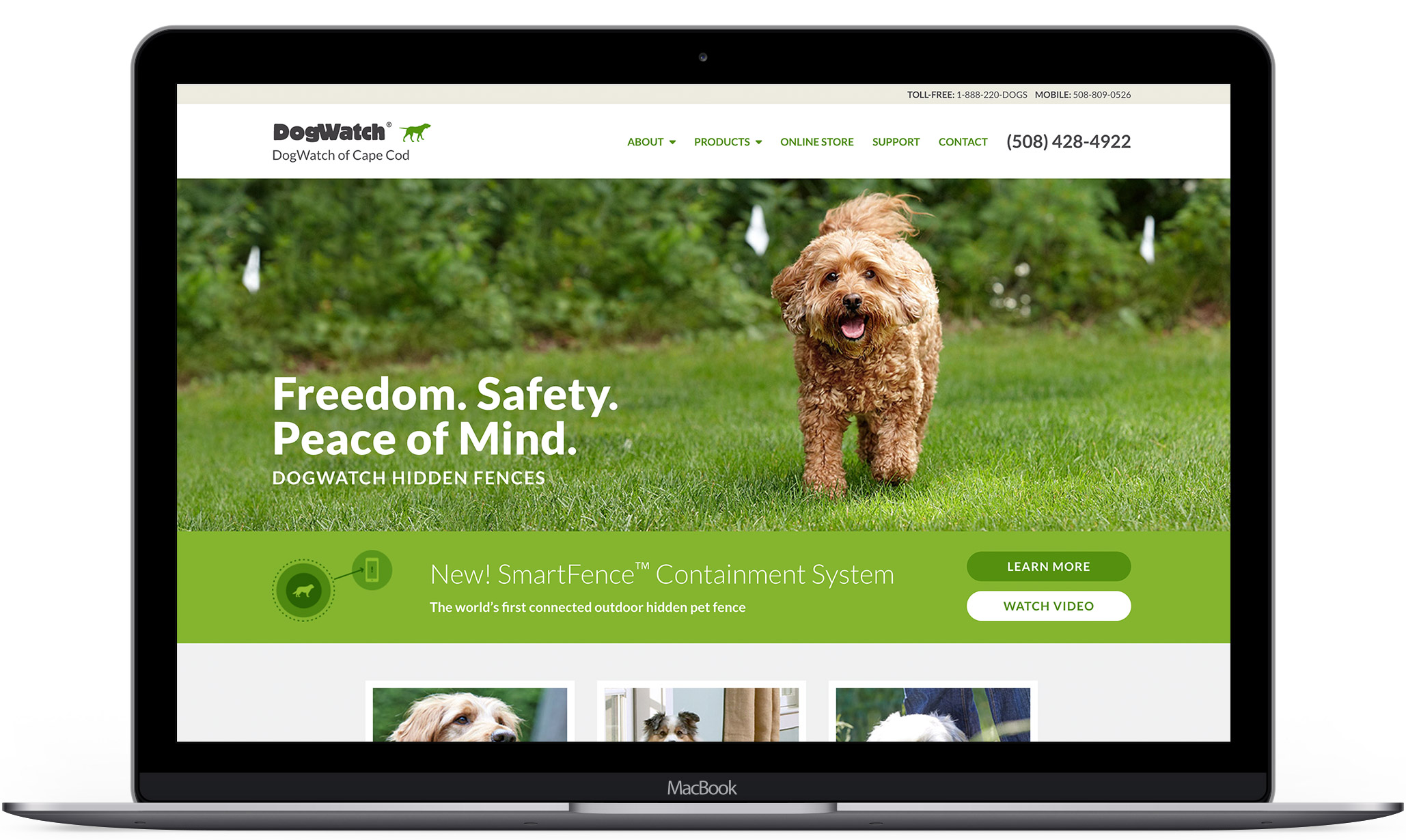
Corporate Website
Design by me
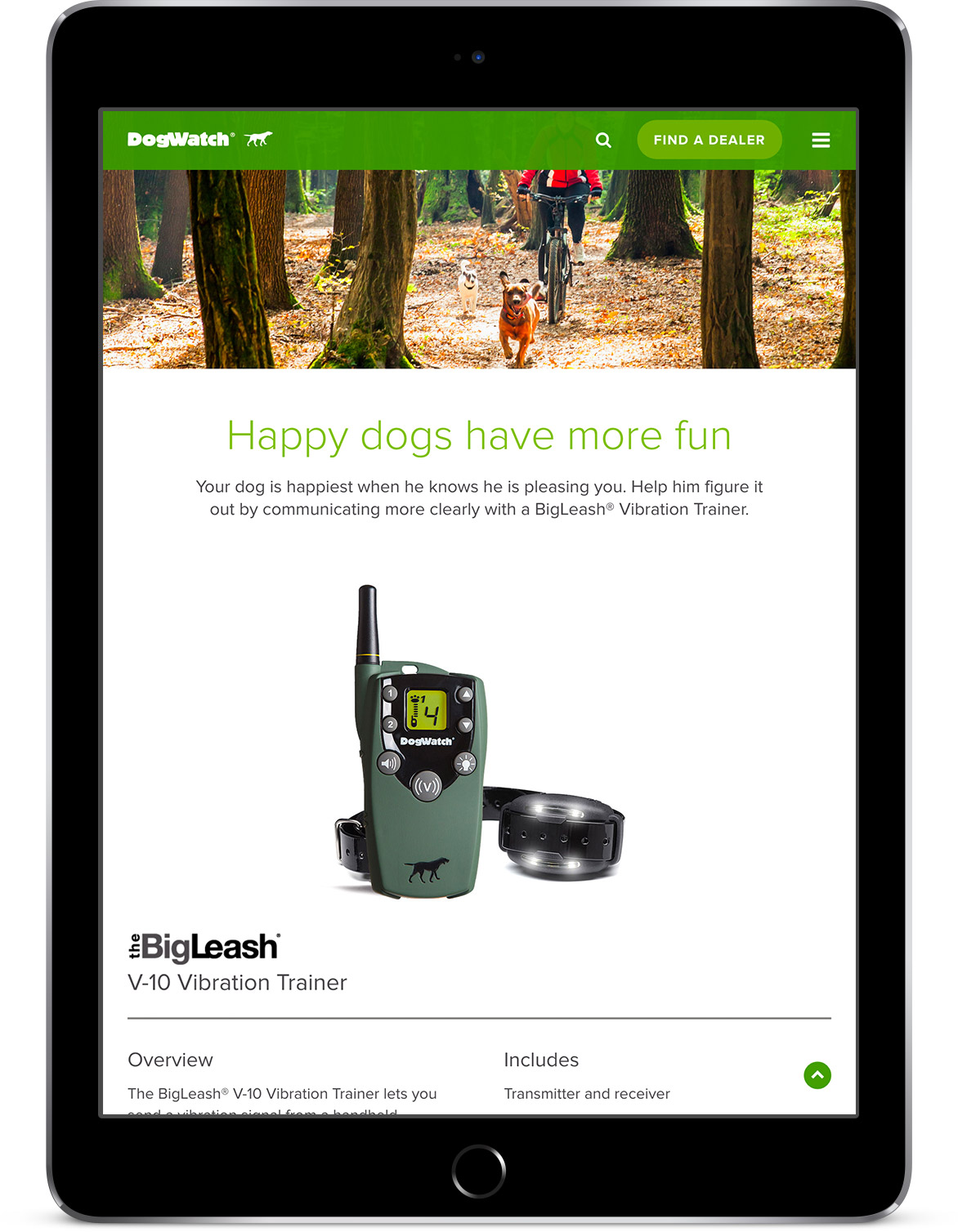
Training Products Website
Design by me
Establishing a design system
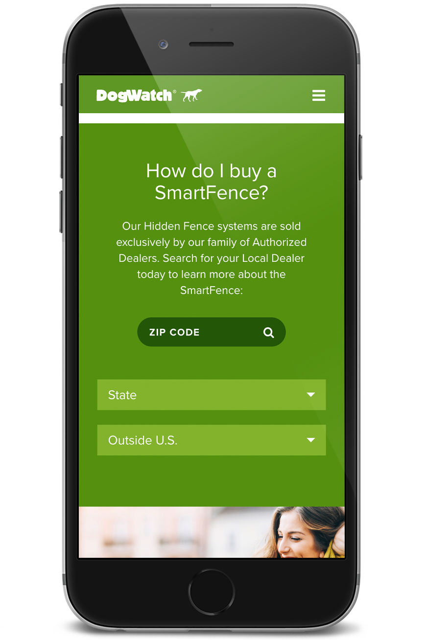
The project started with the launch of a website to showcase a new line of products. This lead to the re-design of the main website, and subsequently the network of dealer websites. I created a design system that would be applied to all digital components of the brand, including an app for a new product.

A fresh take
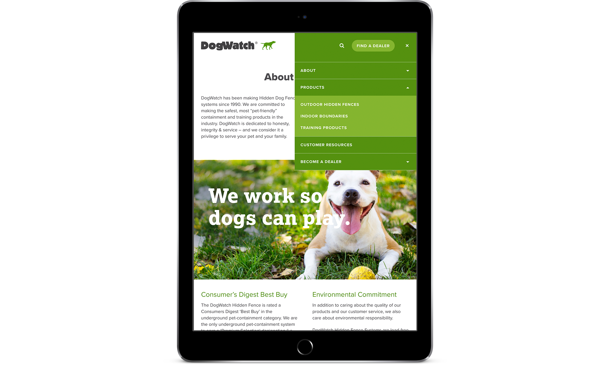
One of our goals was to make the brand feel more lively. By adjusting the proportion of the existing color palette we could achieve a fun, more modern look. Featuring the primary DogWatch green served both to reinforce the brand and mimic the fresh, leafy greens of backyards where their products are used. Adding supplementary shades of green gave us more flexibility. We made the tan lighter and reduced its prominence to brighten the site.
Creating a lifestyle
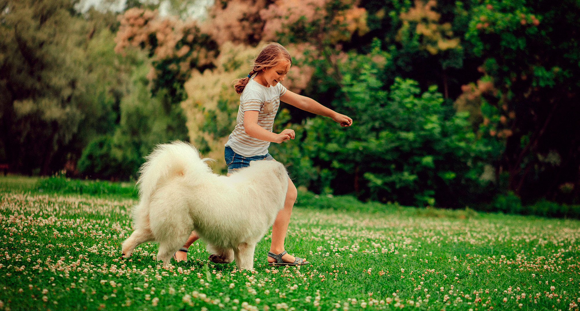
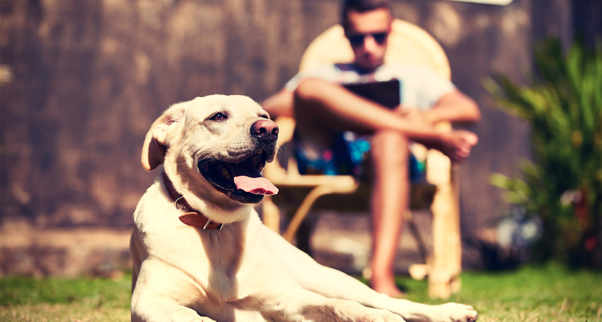
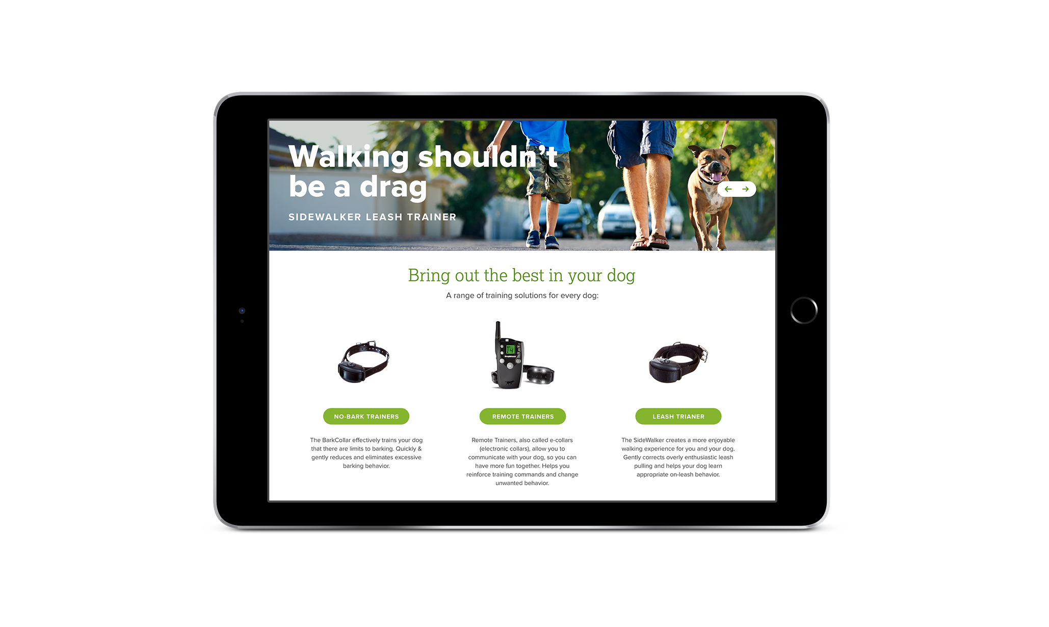
A key component missing from the existing site was a narrative that connected with customers. To remedy this, we shifted the subject of the imagery to highlight pet owners and the joys of having a pet. I worked closely with the client to select photos that featured products in a new context, yet felt at home with their brand.


Friendly type
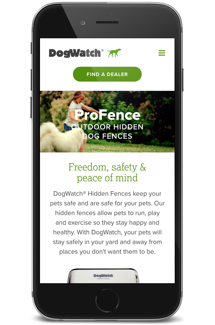
Proxima Nova was in use as the body font and we maintained it for its friendliness and readability on screens. For headlines, the Extra Bold weight has a bubbly quality that nods to the DogWatch logo font. To consolidate the number of typefaces being used across print materials we brought the slab serif Lexia in as an accent.
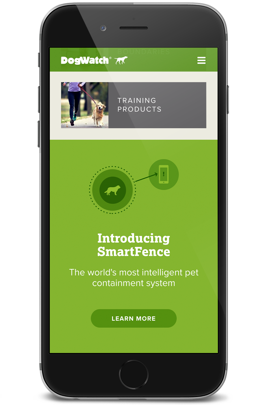
Improving UI
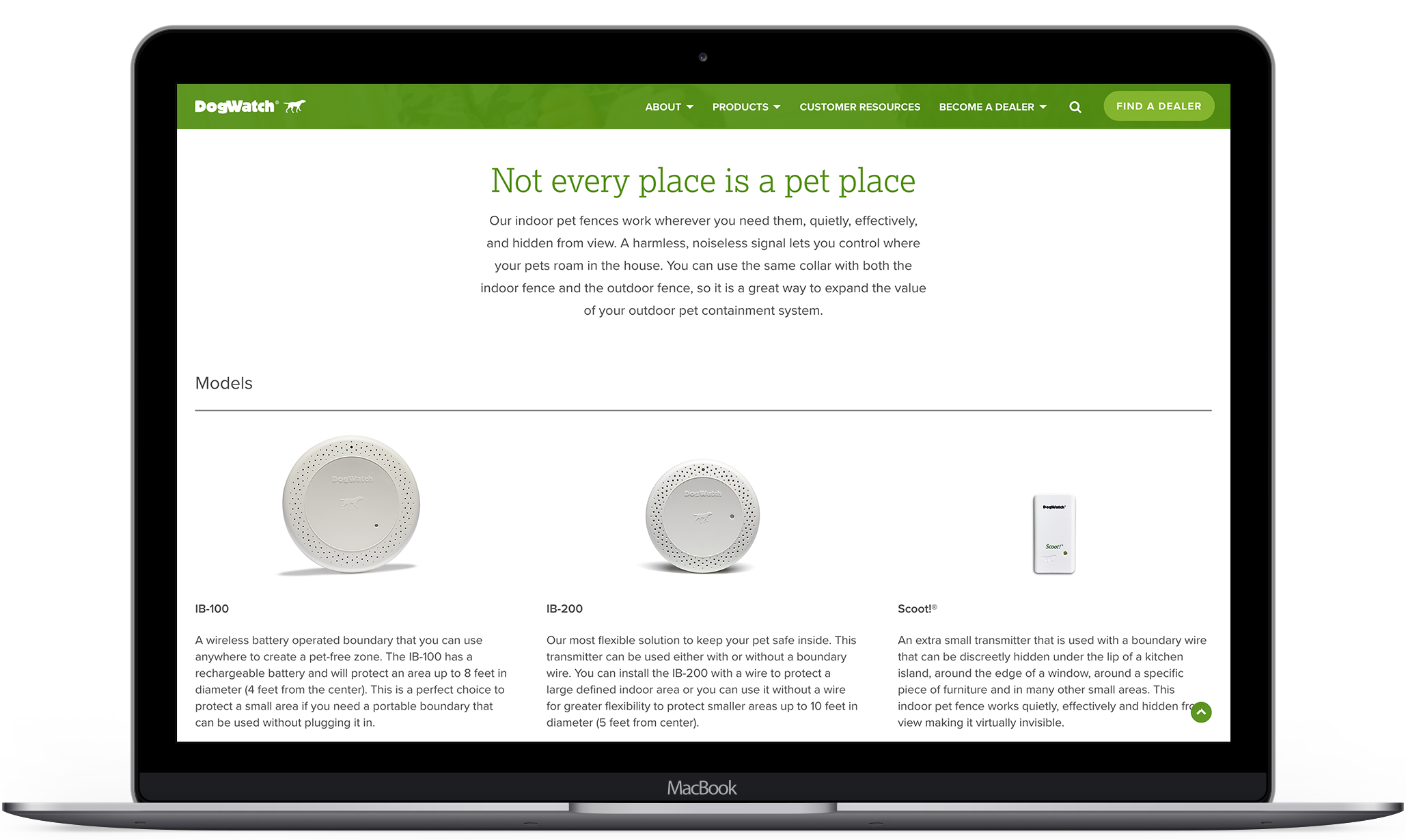
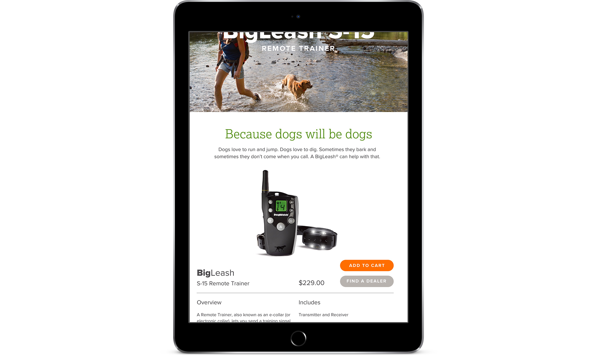
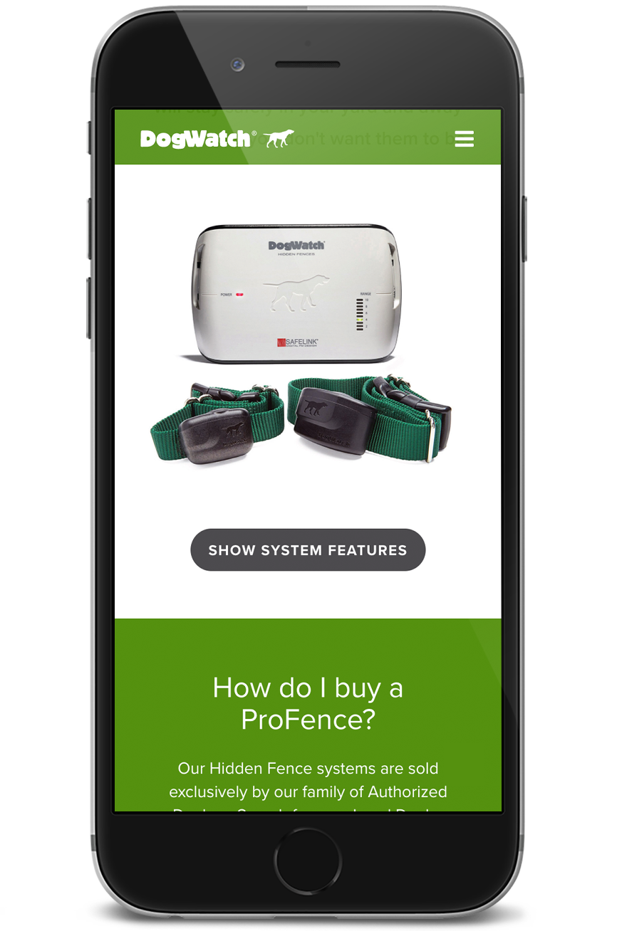
To make the DogWatch sites ready for use across devices, we needed to modernize the interface. This included removing the sidebar and expanding the content width, increasing type sizes, reworking navigation to seamlessly integrate dealer and site search functions, and designing interactive elements to be suitable for touch screens.
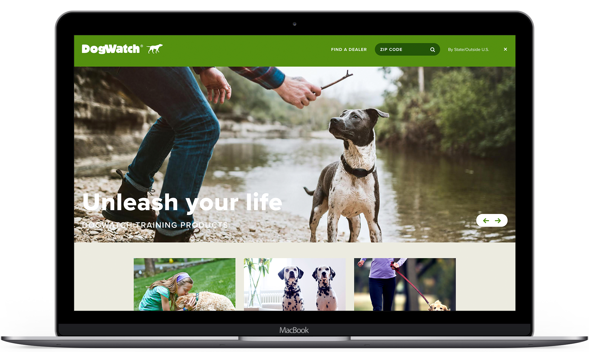
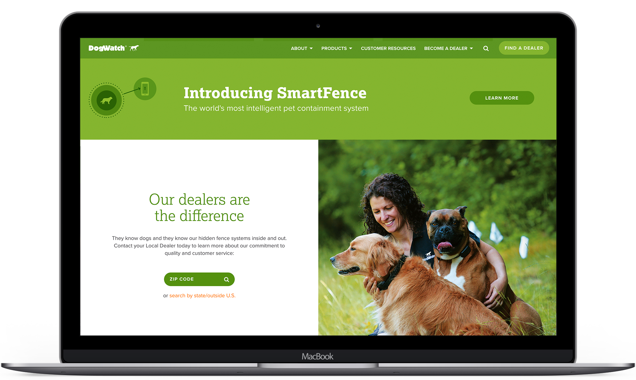
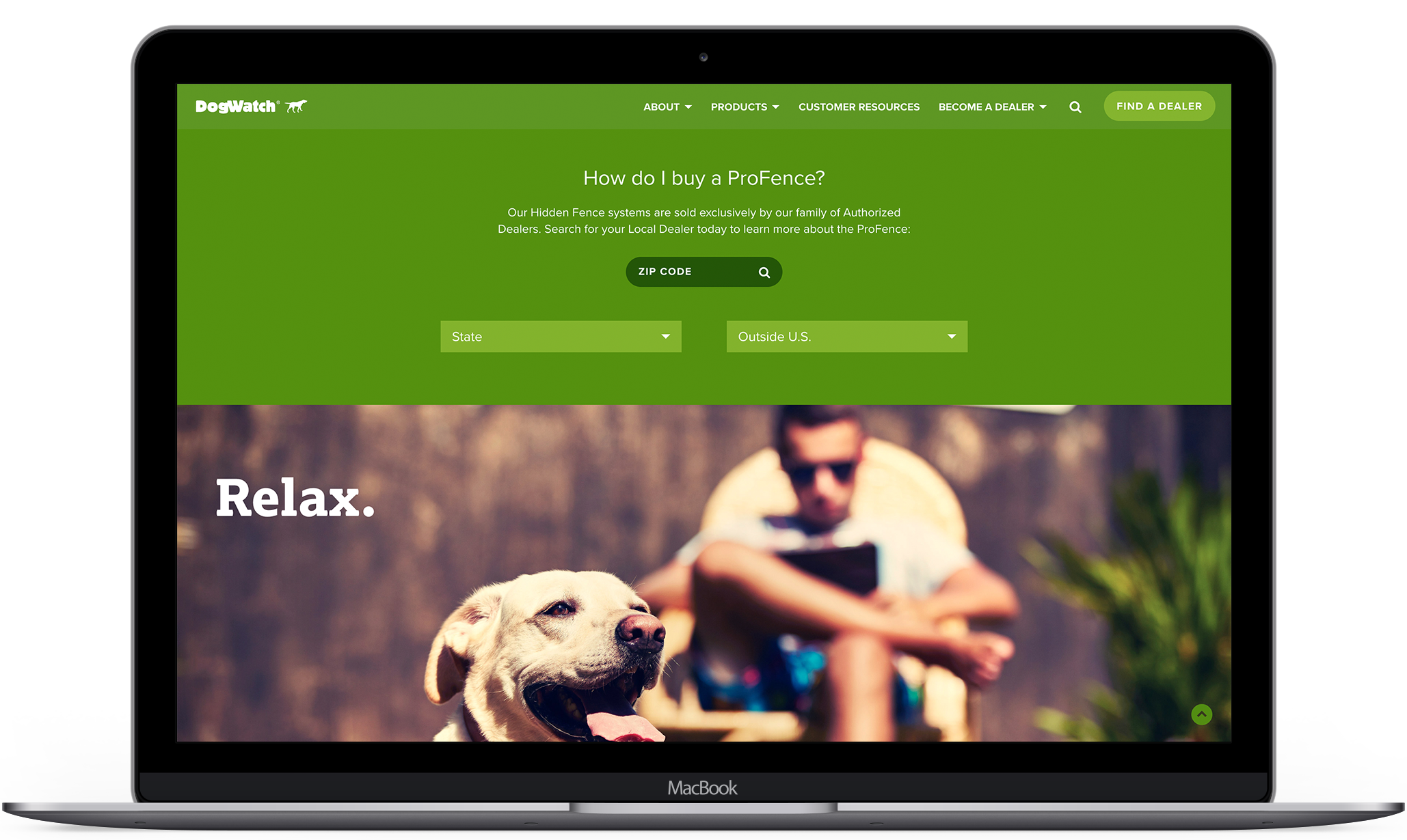
Making room for the brand story
DogWatch prides itself on the technical product features that set them apart from their competition. However, the site featured these specs at the expense of expressing the more emotional aspects of owning the products. To acheive our goal of creating a lifestyle around the products we were able to adjust the UI to shift the focus while keeping the technical information available.
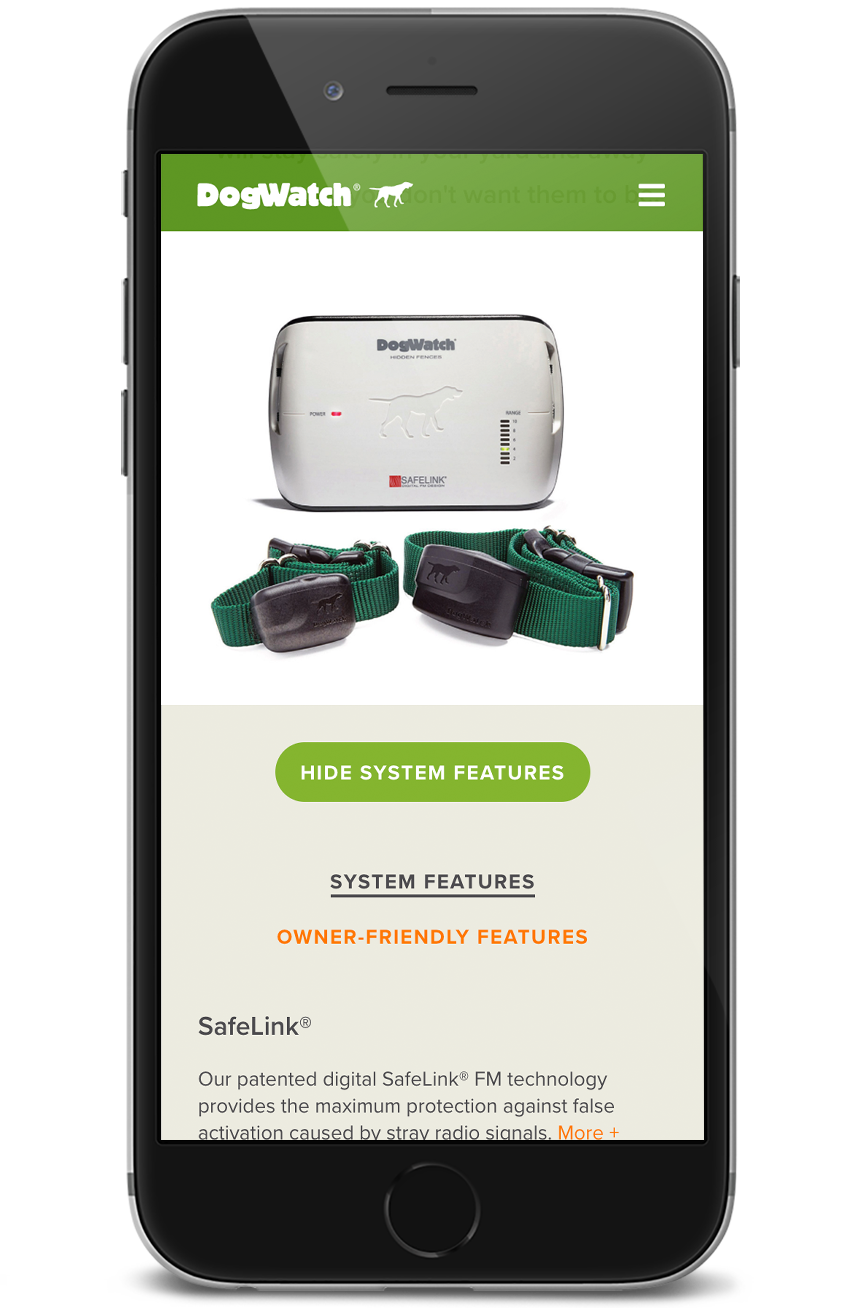
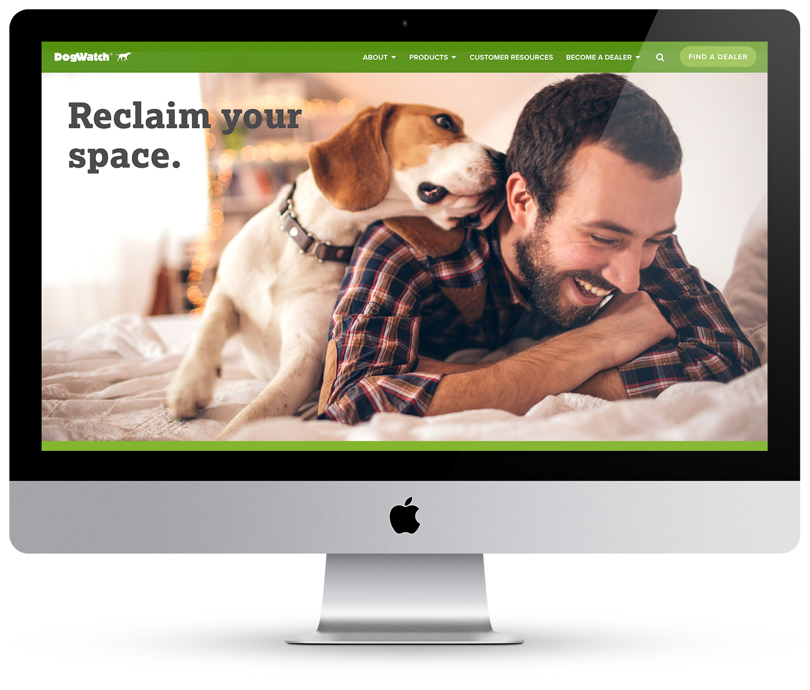
Result
An improved web experience that connects with customers through storytelling; a cohesive system that unites multiple touchpoints of the brand.
Selected Works
Design SystemProduct Design
Compensation ToolData & Analytics Product Design

Hollister Staffing + InstituteWeb Design

DogWatchWeb Design

Broker WebsiteWeb Design
Give me a holler
© 2018 Emily Hamre
